-
I want to thank all the members that have upgraded your accounts. I truly appreciate your support of the site monetarily. Supporting the site keeps this site up and running as a lot of work daily goes on behind the scenes. Click to Support Signs101 ...
You are using an out of date browser. It may not display this or other websites correctly.
You should upgrade or use an alternative browser.
You should upgrade or use an alternative browser.
need opinions on layout
- Thread starter slappy
- Start date

signcrafters london
New Member
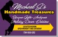
briankb is right. Handmade Treasures should be the main focus. With a business like this, what they do is more important than who they are. Customers are going to stop because it is an antique store, not because Michael J owns it.
The business is actually called Michael J's. I came up with the "handmade treasures" part.. actually "a shop of handmade treasures" then we shortened it. Only reason i suggested it to my customer is because he makes all the crafts there and the name really didn't do much for him other then listing what was in the barn.
I had the name in a script lettering, but the 'j' kept messing with and i couldn't lay it out without looking weird, so i switched them...
I had the name in a script lettering, but the 'j' kept messing with and i couldn't lay it out without looking weird, so i switched them...

SignManiac
New Member
 Nice improvement Jill
Dean Fowell
New Member
Jill ,
That looks good, thumbs up
That looks good, thumbs up
Marlene
New Member
the handmade treasures could be just about anything and I'm not sure from the look of the sign and the colors if that tells people what he does. just what does he make? bend over ladies and lawn whirly things? if not, the colors and layout kind of say that to me. if that is what he makes, then this is a good idea for a layout and colors. if he does primitive type stuff with willow tree designs, woody/bark things then this is so not the direction to go in for either colors or layout.
"Deposit Please"
New Member
Like everyone said...too many different fonts being used... and handmade treasures should be the focal point. Not sure with the color either. Reminds me of halloween.
Dentafrice
New Member
I think I'm going to be the only one that is going to complain that I hate your arrow.
It sets "LOCATED IN BARN" too far to the left, and that's the first thing that caught my eye since everything else is aligned.
Plus the arrow is ugly and, in my opinion, doesn't really match the sign unless you're going for a Robin Hood sort of look.
Orange oval is too large, and isn't as organized as it should be.. You have one bullet, but two options on the bottom.. Holiday Decor & Much More as an option.. I just think that needs revised.
I really like the top for some reason though..") Just my $0.02.
Just my $0.02.
It sets "LOCATED IN BARN" too far to the left, and that's the first thing that caught my eye since everything else is aligned.
Plus the arrow is ugly and, in my opinion, doesn't really match the sign unless you're going for a Robin Hood sort of look.
Orange oval is too large, and isn't as organized as it should be.. You have one bullet, but two options on the bottom.. Holiday Decor & Much More as an option.. I just think that needs revised.
I really like the top for some reason though..
Just my $0.02.John Butto
New Member
a hand pointing to the barn would matchup with the handmade at top, MrChips had a couple on his signs the other day
sar bossier
New Member
Too many fonts, too crowded, weird looking arrow.
Less emphasis on who he is, more on what he's selling.
You know I had to offer a suggestion.
I'd pump the orange up to a more schoolbus yellow.
Love....Jill


My - you are TOO good for words! My hat is off to you, Goddess of design!
John Butto
New Member
anothertake
get the barn antique thing going
get the barn antique thing going
well... i appreciate everyone's input, and i know, purple is not the color for this... but however my arrow is straighter then my customer
but what if i went in a different direction (NOT COMPLETED IN LAYOUT SO THERE IS SPACE FOR THE NUMBER) but this is an idea i hope??? My budget is only $400. I'm not building the frame.
Opinions on this direction?? with the "grungy feel/ rustic" background??
but what if i went in a different direction (NOT COMPLETED IN LAYOUT SO THERE IS SPACE FOR THE NUMBER) but this is an idea i hope??? My budget is only $400. I'm not building the frame.
Opinions on this direction?? with the "grungy feel/ rustic" background??