-
I want to thank all the members that have upgraded your accounts. I truly appreciate your support of the site monetarily. Supporting the site keeps this site up and running as a lot of work daily goes on behind the scenes. Click to Support Signs101 ...
You are using an out of date browser. It may not display this or other websites correctly.
You should upgrade or use an alternative browser.
You should upgrade or use an alternative browser.
Need some input please
- Thread starter laserman70
- Start date
John Butto
New Member
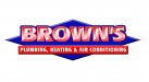
left one
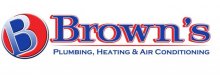
Right one = B ball, Browns, looks like an ESPN half court shootout logo.
The left one looks more in sync with what the industry does, a 50's look.
Right one = B ball, Browns, looks like an ESPN half court shootout logo.
The left one looks more in sync with what the industry does, a 50's look.
Colin
New Member
How about something in terms of a graphic element that relates to plumbing, heating etc?
The one on the right reminds me of Boston Pizza.
The one on the right reminds me of Boston Pizza.