• I want to thank all the members that have upgraded your accounts. I truly appreciate your support of the site monetarily. Supporting the site keeps this site up and running as a lot of work daily goes on behind the scenes. Click to Support Signs101 ...

New Artist Font, Saddle, by Noel Weber

Flame

New Member
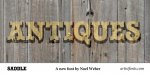
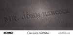
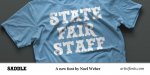
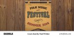
I'm proud to announce our newest font to the Artist Font Collection...Saddle. Created by Noel Weber, it's now available for sale here http://artistfonts.com/saddle.html

Some samples are attached! Would love to hear feedback.
 

Attachments

  • saddle-example1-antiques.jpg
    saddle-example1-antiques.jpg
    63.7 KB · Views: 68
  • saddle-example2-leather.jpg
    saddle-example2-leather.jpg
    37.3 KB · Views: 62
  • saddle-example3-wood.jpg
    saddle-example3-wood.jpg
    75.8 KB · Views: 70
  • saddle-example4-shirt.jpg
    saddle-example4-shirt.jpg
    36.4 KB · Views: 53
  • saddle-example5-banner.jpg
    saddle-example5-banner.jpg
    51.6 KB · Views: 59

bob

It's better to have two hands than one glove.
It looks very much like at least a dozen others. Efforts like the freebee 'madfont', 'LHFcartooncowboy', 'LHFfancyfullround', and a host of others. The world really doesn't need Yet Another heavy serif western type face. There's plenty of them. While they all have their differences, they remain sufficiently close as to be interchangeable.
 

Joe Diaz

New Member
It looks very much like at least a dozen others. Efforts like the freebee 'madfont', 'LHFcartooncowboy', 'LHFfancyfullround', and a host of others. The world really doesn't need Yet Another heavy serif western type face. There's plenty of them. While they all have their differences, they remain sufficiently close as to be interchangeable.

I kind of have a similar feeling about internet trolls. Do we really need more "bobs" out there?

Looking good Flame and Noel!
 

jdb

New Member
Actually this font is very different than other western type fonts I've seen. You get two fonts in the package.
The outline font with the crowns is very unique. Here's a cool example.
 

Attachments

  • saddle-example6-rollingstones.jpg
    saddle-example6-rollingstones.jpg
    24.1 KB · Views: 66

Speedsterbeast

New Member
Well presented. However, if you're looking for feedback, I don't care for the lower right of the letter "N" It doesn't match any of the other letters like "M" and when it sits before the "T" in GENTLEMEN it looks funny. Sorry. I noticed it so I thought I'd throw that at you.
 
Top