-
I want to thank all the members that have upgraded your accounts. I truly appreciate your support of the site monetarily. Supporting the site keeps this site up and running as a lot of work daily goes on behind the scenes. Click to Support Signs101 ...
You are using an out of date browser. It may not display this or other websites correctly.
You should upgrade or use an alternative browser.
You should upgrade or use an alternative browser.
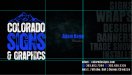
New BC Design.
- Thread starter HulkSmash
- Start date

tonywhittier
New Member
i like it a lot...
maybe on the all black side add like a little bit of smoke or something in the background behind the logo (think of a cooler when you open it or something cold)
maybe on the all black side add like a little bit of smoke or something in the background behind the logo (think of a cooler when you open it or something cold)
HulkSmash
New Member
i like it a lot...
maybe on the all black side add like a little bit of smoke or something in the background behind the logo (think of a cooler when you open it or something cold)
that texture is actually there, but you can't see it when it uploads in RGB..
tonywhittier
New Member
that texture is actually there, but you can't see it when it uploads in RGB..
well then it looks great to me!
TheSellOut
New Member
Looks Awesome Adam!! If I were to suggest anything it would be to use lighter versions of the fonts for the info in the lower right corner. It took me a long time to get it through my head that BOLD does not always make lettering stand out more. I would also suggest that for your name too, but I think I would rather see your name in white as the blue an black are blurring together too much with that heavy font.
Great work!!
Great work!!
TheSellOut
New Member
So far it has been great and I am really happy that I made the move! Thanks for asking, I figured on doing a follow up thread after a month into it!

Craig Sjoquist
New Member
Looks great if your selling as....Colorado graphics and signs.
My self would do Colorado in a lower case anyway, with still the good looking box layout like you have.
My self would do Colorado in a lower case anyway, with still the good looking box layout like you have.
SignManiac
New Member
Nice. It took me a moment to figure out what "BC" meant.
+1 don't know many of these new biz abbrevs
tonywhittier
New Member
Why don't you use the ink from the Coors Light can that turns blue when its cold? that'd be cool...

Tim Aucoin
New Member
Looks good Adam. The only thing that sort of stood out to me was the "H" in graphics. For some reason, when i first look at the word, the "H" looks like a "K". I think it's the placement of the effect and the darkness of it that distorts the H just a little too much. But, it could just be me! I stare at business cards every day, as I cut down around 5-10 orders a day, and little things tend to stand out to me more than they would to others...
Make sure that whoever prints them for you adjusts their digital output to pick up the background graphic. It's a tough one to get the full affect on if they don't tweak their output a little. Also depends on the box they're using.
The die cutting idea would be cool, but you are right... for the amount you use, it could get costly. The die is a one-time fee, but most shops that I deal with charge anywhere from $60 - $150 to die cut cards with an existing die... just depends on quantity.
They would look cool printed on clear Lexan with a white flood on the back to highlight the mountains...
Negative space is a little awkward on the front side, did you grid the design? See attached, logo is low in relation and there doesn't seem to be any intentional grid structure, objects seem to be arbitrarily placed in relation to their surrounding negative space. Ends up feeling uncomfortable.