-
I want to thank all the members that have upgraded your accounts. I truly appreciate your support of the site monetarily. Supporting the site keeps this site up and running as a lot of work daily goes on behind the scenes. Click to Support Signs101 ...
You are using an out of date browser. It may not display this or other websites correctly.
You should upgrade or use an alternative browser.
You should upgrade or use an alternative browser.
New idea on business cards
- Thread starter klingsdesigns
- Start date

SameDay Signs
New Member
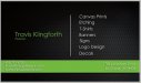
I like them but I think the side with all your info on it where the light green line on the bottom is it becomes hard to read the info on it. Just my opinion but like the layout
Gino
Premium Subscriber
I think, rather than, we design it, perhaps....we make it, or make it happen.
Also, I think it could e about 20% or 25%bigger.
The other side is gonna be a little hard to read for anyone much over 40. Remember, its a business card, not a brochure.
I do like the colors, just not the way they are put together at the moment.
Also, I think it could e about 20% or 25%bigger.
The other side is gonna be a little hard to read for anyone much over 40. Remember, its a business card, not a brochure.
I do like the colors, just not the way they are put together at the moment.
klingsdesigns
New Member


klingsdesigns
New Member

John in Cali
New Member
Are textured finishes available for business cards? That might be interesting.
")
visual800
Active Member
Depth Sir! and as far as the "Fighting Sperm" in the back ground make it so they are there but very dismal. They take away from the design when they are the same color. I placed a lighter color border on them so as you would still see them but not really, if you follow me
I dont care for Serpentine but this is what you chose and its not that bad. I dig the metal background. I think you have something to start with. please see attached
I dont care for Serpentine but this is what you chose and its not that bad. I dig the metal background. I think you have something to start with. please see attached
Attachments
![back [Converted].jpg](/data/attachments/86/86407-f81766b1e95a64b5e9a61691295f702f.jpg)
Jillbeans
New Member
The back seems OK enough, I would change the font color in the green band to black because there is not enough contrast.
On the front of the card, I would suggest a different font. If you have that one everything forever, and are married to it, I understand. But Serpentine screams 1990s to me. I'd like to see something bolder and sans-serif.
The lettering is lost, contrast-wise. I would make the name in white with a black outline, then bring in the green swooshy stuff. I feel that you are focusing too much on the cool background pattern and not enough on the message.
Love....Jill
thinksigns
SnowFlake
I think the comma in your tagline should be a period.