-
I want to thank all the members that have upgraded your accounts. I truly appreciate your support of the site monetarily. Supporting the site keeps this site up and running as a lot of work daily goes on behind the scenes. Click to Support Signs101 ...
You are using an out of date browser. It may not display this or other websites correctly.
You should upgrade or use an alternative browser.
You should upgrade or use an alternative browser.
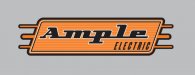
New Logo (Ample Electric)
- Thread starter HaroldDesign
- Start date

")
Pat Whatley
New Member
Isn't retro old by default?
HaroldDesign
New Member
Around here it's all lightening bolts and terrible things made by someone's artist kid, so for it to have style at all will have a lot of appeal!
rjpjr
New Member
Thoughts on this? ...
IMHO...
a little off balance and top heavy
not quite enough contast
too complicated
not quite enough contast
too complicated
a quick revision...
Attachments

SignManiac
New Member
I would have to agree with RJ Less is more.
signcrafters london
New Member
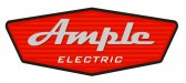
I like it, but my first thought was "muffler shop."
HaroldDesign
New Member
Thanks guys. Useful input!
qmr55
New Member
If you're gonna go retro, might as well go all the way. Just another direction here, I don't like the whole rectangle thing I think it is a little boring and if you research retro signage most of them are odd ball shapes and things like that. This is just a quickie but could be another direction you could approach it at!
Attachments
TyrantDesigner
Art! Hot and fresh.
I think it looks pretty cool, just the retro theme is getting pretty old though.
It must be a sign shop thing ... cause all the logo's I end up doing while freelancing are never retro, but I swear every other company that wants a logo while I'm at work ... wants retro styling.
HaroldDesign
New Member
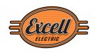
Oh Boy - He really like it, but decided to register as Excell Electric at the last minute. Said he didn't know I would bring the sketch to life so quickly. Anyway, he also stated that he wanted me to combine one and the other, so I turned it into this. We'll discuss things this evening. I'm actually not sure if he wants it spelled Excell or Excel! I didn't set out for a "retro" look - It just ended up being a good style to work plug ends into it without being obvious while having aesthetic value.
Attachments
J Hill Designs
New Member
a little off balance
signcrafters london
New Member
a little off balance
Could you try it with some kind of icon or graphic above the Excell?
HaroldDesign
New Member
Keep the suggestions coming! I'm probably not going to touch it until I have a chance to talk with him more, but I'm keeping my eye on this thread because it helps develop new ideas in my head in the meantime.
wildside
New Member
a little off balance

the oblong oval makes it look very off balance