-
I want to thank all the members that have upgraded your accounts. I truly appreciate your support of the site monetarily. Supporting the site keeps this site up and running as a lot of work daily goes on behind the scenes. Click to Support Signs101 ...
You are using an out of date browser. It may not display this or other websites correctly.
You should upgrade or use an alternative browser.
You should upgrade or use an alternative browser.
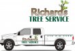
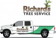
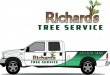
New logo and truck layout
- Thread starter Williams Signs
- Start date
Williams Signs
New Member
Thought about that but was thinking the brown as the bark and the green as the grass.
James Chrimes
New Member
signmeup
New Member
I was too lazy. I like the gradient! We don't know if the budget will support a coloured swoosh but I think it helps.I like the concept. Something about it seems a little desprate to me though. I like Adrians idea, but would make the phone number smaller to fit in the color.
Gino
Premium Subscriber
I like the concept. Something about it seems a little desprate to me though. I like Adrians idea, but would make the phone number smaller to fit in the color.
 That's nice.
signmeup
New Member
Thanks.


Marlene
New Member
I like Adrians idea
me too
I also like the concept of what you did as suggest you try the couple of tweeks to kick it up a notch