-
I want to thank all the members that have upgraded your accounts. I truly appreciate your support of the site monetarily. Supporting the site keeps this site up and running as a lot of work daily goes on behind the scenes. Click to Support Signs101 ...
You are using an out of date browser. It may not display this or other websites correctly.
You should upgrade or use an alternative browser.
You should upgrade or use an alternative browser.
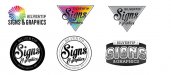
New logo ideas for critique!
- Thread starter Silvertip
- Start date
J Hill Designs
New Member
I'm a fan of top left
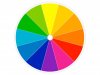
Any thoughts of trying an actual color wheel?

The "broken up" one with all those colors just doesn't give me anything to relate to.
I'd love to see one of the circular versions with the Signs & graphics spanning out over the edges of the circle and a nice thick outline to give it both its deserved priority, but also to separate it from the ring behind it and give the whole logo some depth. This is a logo I did that kind of illustrates what I'm talking about.
Attachments

shoresigns
New Member
Your hierarchy is backward. Your company name is Silvertip, not "Signs & Graphics".
Pat Whatley
New Member

Silvertip
Silvertip Graphics Signs & Designs, Inc.
Thank you!
All good stuff! Pat the bear thing makes me laugh! Good stuff!
I really was going away from the top left as to me it sends more of a "print shop" message than a "sign shop" message so I am glad that I put them up here to get your take on them.
In the end I may go more towards the circular one. Yes I will take the advice to get Signs outside the circle too. Need to find a better font there too I think so if you have suggestions there") .
.
Thanks ladies and gentlemen..back to the artboard! Still working on a tagline but might not use one this go round. I want to use the word "image" again but haven't had any real brainstorms with it so might be better to leave off.
I will try to post more fixes and options again soon!
Thanks all!
All good stuff! Pat the bear thing makes me laugh! Good stuff!
I really was going away from the top left as to me it sends more of a "print shop" message than a "sign shop" message so I am glad that I put them up here to get your take on them.
In the end I may go more towards the circular one. Yes I will take the advice to get Signs outside the circle too. Need to find a better font there too I think so if you have suggestions there
.Thanks ladies and gentlemen..back to the artboard! Still working on a tagline but might not use one this go round. I want to use the word "image" again but haven't had any real brainstorms with it so might be better to leave off.
I will try to post more fixes and options again soon!
Thanks all!
Gino
Premium Subscriber
Well, the triangles take your eye right off the subject matter. Not good to point downward away from everything. You want a logo to sorta flow so your eye can take it all in quite easily.
While you want flow, the circles are a waste of valuable space.
The fonts you picked are kinda wonky.
Top left could work, but will be very weak at any given distance.
I think you still need to search your soul some more.
Did you ever consider hiring someone to do this for you ?? It's not something you're gonna learn overnight.... as you can clearly see. Sometimes creating for oneself, is the hardest thing to do. We all want to do the best job we can, but we get in our own way. As with the last time..... you need to re-charge your batteries and come at this again, but from another angle. This one is exhausted rather quickly.
The rainbow bear needs more cowbell.
BIG EASY DOES IT
New Member
I like the bottom middle. More classic. Only thing I don't like is your co. name seems to drown out in the circle to me.
BIG EASY DOES IT
New Member
Silvertip is that a geriatric falice?
I'm Liking the Top-Center one best, mainly for the lettering in the word "Signs"... However, I do not like the black outline around the triangle. I do like all the color in the triangle.
The words "& Graphics" is hard to read. I agree with other post, Silvertip may need more attention.
The words "& Graphics" is hard to read. I agree with other post, Silvertip may need more attention.
shoresigns
New Member
That's actually a good point and often debated. I think for small businesses the name & the service/product need equal weight.
I see where you're coming from, but I have to respectfully disagree. You can't give equal weight to the top two items in a hierarchy. It would break the hierarchy by way of the two items competing with each other.
Additionally, I can't think of any logical reason that the service/product needs to be at the top of the hierarchy, even for a small business. It just needs to be clear and present in the logo. The name should always be the focus, because that's your brand and it's what you want people to remember, by repetition (and reputation).