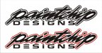
paintchipdesigns
New Member
Trying to decide on a main logo to use 90% of the time
Paint chip is something I would either think of an interior designer showing a client or something that an auto body fixes.
Oh, and if you use an element for your logo ... make it yourself.
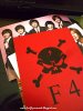
alright, i'll bite. what j-pop group is in picture 2?
if you say firefly grenade i'll smack you and demand a link
The skull came out of a clip art book and was not downloaded illegally.