• I want to thank all the members that have upgraded your accounts. I truly appreciate your support of the site monetarily. Supporting the site keeps this site up and running as a lot of work daily goes on behind the scenes. Click to Support Signs101 ...

New logo

Craig Sjoquist

New Member
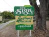
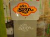
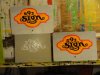
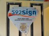
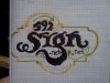
Well here it is Hand drawn & hand lettered.

In real I've not been happy with most of my versions that I've done over the years so would keep them awhile then change, so it has come to this which I like alot.

Also as improvements take place, I'll be trying create a font with this.

So critique is more then welcome, this is why it's put it up for review thank you.

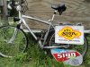
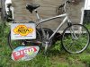
Oh the double panel ones are going on my bicycle ( the reason for Fluorescent ) The other just doing & probably age it later when fully done also color changes are coming.

Mainly concerned about Font & looks of logo.
 

Attachments

  • logo 002.JPG
    logo 002.JPG
    105.7 KB · Views: 103
  • logo 003.JPG
    logo 003.JPG
    111.7 KB · Views: 79

Jillbeans

New Member
Craig that looks really pretty.
I think if it were me I would have made the lettering slightly tighter together but that's just a personal preference.
All in all, it's fun and stylish.
Love....Jill
 

Marlene

New Member
I like the "signs.net". I like how you embedded the .net in the word. I like that the font for signs is hand done. it really showcases your talent. not to crazy for the numbers as the "9" stands out way too much. having a big 9 may make sense if you are on route 9 or something like that, but as a three digit number it looks odd to me to see one big number in the middle. what I really don't like is the offset background as it looks like it melted and slide out of shape. I like asymmetry but not on something that normally is seen as symmetrical like that sign blank background. I'd work on re-setting the numbers and would find a different background and I think that would do it.
 

Craig Sjoquist

New Member
Thank you
Fun & stylish, that is direction I'm glad & aiming for.
As far as tighter, this is a tough font to read loosen up helps that at a distance, but tighter makes it more appealing .. what do ya do ?.. I mostly go for readable
.. The .net is a problem I need to solve & more readable after lettering I was not happy with.
.. As far as the # 9 being big it was for the dot in I also many people have in past confused the 592 with 529 hopes the big 9 that will help.
Asymmetry if it works on the 9 I'll be more then happy, also like it being a bit odd to attract the eye maybe if works.

Thank you again this critique is what I'm looking for cause Signs 101 is a great way to speak with others & get some real opinions. ..Hope to see more.
 

TXFB.INS

New Member
the ".net" does get lost in the layout

at first glance I thought it was "ce.net" or "cl.net" with the design
 

Perks

New Member
Thats very cool! Reminds me a little of the Beatles yellow submarine shape. Got any medieval or calligraphy style fonts in your library for the 592?
 

Craig Sjoquist

New Member
Well here it is on bicycle plus last 2 older ones.

Will be making changes such as putting ..net back under N of sign instead inside G as I develop logo to permanent logo. But for now & till these get scratched up.
 

Attachments

  • aug 28 12 011.JPG
    aug 28 12 011.JPG
    121.2 KB · Views: 67
  • aug 28 12 012.JPG
    aug 28 12 012.JPG
    116.8 KB · Views: 70
  • aug 28 12 013.JPG
    aug 28 12 013.JPG
    92.3 KB · Views: 80

TyrantDesigner

Art! Hot and fresh.
Good stuff Craig.

Alrighty then lets get to the gravy. Attached is a quick sketch. Basically, one of the things that visually doesn't jive with me is the bottom of the g in signs ... there is a lot of care and attention to create a dynamic style of lettering, but the bottom of the G does not reflect that almost organic quality, plus the little loopty loop doesn't need repeating. Keep it simple, make it have the same accents that are on the body of the SIGN typeface and probably move the .net to the side. Also, not digging the 595 being stacked at different sizes, a little bit of sloaping on the 5 and 2 can get you the same affect but just look more intentional. Classy though, so +1 to that.
 

Attachments

  • IMG_20120912_125202.jpg
    IMG_20120912_125202.jpg
    58 KB · Views: 61

Gino

Premium Subscriber
First of all..... do you haul that trailer with your bike ?? :omg2: :U Rock:


I like the original pictures and the color combination all work well together, but once you added all the extra words, you blew just about every rule in the rule book..... it's terribly overcrowded and to me, it's overkill and then my eye shuts down and I don't bother reading anything at all.

I would just put at the bottom 'Traditional Hand-Lettering' and skip the rest of it. No one cares when you started. If they see you, they'll know you've been around for a while. As for gilding or designs, let them ask you.

When someone starts naming all the things they do, most people don't think you do the other things. Just let them know you make signs...... and the rest will fall into place. :rock-n-roll:
 

Dan Antonelli

New Member
Hey Craig!

I'm worried about your legibility here. Ironically, I really love the sign/logo on the grass better-- has a cool retro vibe to it, and has better legibility. If this were primarily used on a business card, I'd say its OK although I'd like the G descender worked on a bit. But outdoor I worry about it's legibility.

Given the limited space you have, I'd go as large and bold as possible. What's interesting is your very likely to get a second look, because advertising on a bike is so rare. So I would hit him hard in the face with it, not make them work as hard for it. You can still express hand lettering while keeping it maybe a touch more legible.

Anyway, thats' my .02. :)

Perhaps also you can get 529 Signs.net -- I'd rather the company name was 529 Signs, not 529 Sign.
 

visual800

Active Member
NO!...this does nothing for me. Regardless of it being hand lettered it's off centered flat and just very plain. I find it hard to focus on it, it is nothing that would attract my attention. maybe it's just not my style. No offense just how I feel
 

Craig Sjoquist

New Member
Ok here what it looks like coming into my driveway
 

Attachments

  • sept logo 12 003.JPG
    sept logo 12 003.JPG
    88.9 KB · Views: 59
  • sept logo 12 001.JPG
    sept logo 12 001.JPG
    105.9 KB · Views: 63

Craig Sjoquist

New Member
Thank you ..Just what I was looking for in critique, & sure glad for forms like Sign 101 were ya different view points that ya can bounce ideas off of.

Tyrant designer.. thank I do like the flow of 592 you suggested why I didn't do this before ?

Gino.. yes I have 3 different trailers & 1 that is being built.
Oh yeah I have a bad habit adding to much copy on stuff that I do for myself, guess I keep it simple more still I change these often so next one I 'll reduce it.

SD&F.. yup moved the .NET 1st thing others picked up also.

Dan .. Liked that one also but know one seen it or even notice in real so I thought a more traditional look like on SIGN might work & it did already sold a job with it & several people -non sign people- have commented on it ..I don't get but hey ok.
Oh 592sign is my phone # guess adding the S would make sense & not matter in name hmmm.

Signmaniac .. I did own 592sign.com for several years till I forgot to pay on time opps it was snapped up, waiting till it becomes available again, Godaddy using it for advertising.

Visual 800 .. Guess this shows I have still have a long way to go in design.

Making it more appealing like this design so many things are were dislike & liked even a novice can see something is wrong, but when it is right the same novice can really like it & not know why. More work on this is well needed indeed.

Thank you again more changes are coming as I work it out in my new CorelDraw X5 just bought & learn how to use designing the SIGN font is one challenge I'm looking forward to & a great goal for me.
 
Top