• I want to thank all the members that have upgraded your accounts. I truly appreciate your support of the site monetarily. Supporting the site keeps this site up and running as a lot of work daily goes on behind the scenes. Click to Support Signs101 ...

new name - new logo

toucan_graphics

New Member
so.... since I am starting back up after nearly 3 years, I am tossing around the idea of a new name and new logo. I have not settled on a name or a logo but I wanted to pop an idea out here for everyone to pick apart.

I have a 2 part question....

1. should I even change the name? (Toucan Graphics)

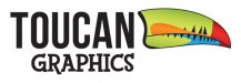
2. If I change, what are your ideas/opinions for a new logo? This is a 2 minute work-up which has potential, but not sure if I should even go in this direction.

I'm usually pretty quick on things and can think up tons of stuff for customers, but doing things for myself I always second guess myself, or pick everything apart.

idea_graphics.png idea_graphics_color.png
 

OhioSignShop

New Member
I like the lightbulb idea, clean and attractive. The old logo reminds me of T-shirt airbrush shops at the beach. Not bad but not commercial graphics for business either. I can see the light bulb graphic used with simple animation on your web site and develop into a great logo. my 2CW
 

signmeup

New Member
What do you do? Is there a website with a portfolio that we can look at to see what you're all about. Kinda hard to give advice without knowing anything about your style or product or position in the marketplace. I realize you've been a member for quite a while but... it's been a while.

BTW... I really like the Toucan name.
 

GAC05

Quit buggin' me
Too dated,
unless you live in Texas, the Feds won't let you use that type of blub any more. You gotta' go green......

wayne k
guam usa
 

Attachments

  • idea.jpg
    idea.jpg
    31.3 KB · Views: 108

Craig Sjoquist

New Member
I like the blue idea graphics, the new type light bulb not sure about, but I think it would work, likes the old light bulb looks cleaner.
 

toucan_graphics

New Member
What do you do? Is there a website with a portfolio that we can look at to see what you're all about. Kinda hard to give advice without knowing anything about your style or product or position in the marketplace. I realize you've been a member for quite a while but... it's been a while.

BTW... I really like the Toucan name.

I do a bit of everything. I make signs, the occasional web graphic, business cards and brochures, but mostly I make signs.

I used to have a portfolio on here but that was 4 years ago, and the web site is long gone as well. I am starting over from scratch.
 

phototec

New Member
From someone who has worked as a graphic designer for the last 20+ years, I can tell you that the Toucan Graphics name and logo is way better than any of the light bulb designs, the light bulb idea has been way over used.

Maybe just tweak the Toucan logo and jazz it up a bit!

If you want to get away from the Toucan name and logo, start over.

Jason, also want to thank you for your service to our country.

:wavingflag:
 

10sacer

New Member
How about Bright Idea Graphics - then your monogram can be B.I.G.. So if you do large stuff like us - you can have a dual purpose name of thinking creatively with Bright Idea or advertising that you do big stuff with B.I.G - people would see that and think either Bright Idea Graphics or BIG graphics which is good for you either way. The "I" could be the lightbulb. I don't have time to mock it up for you...but just a thought.
 

Billct2

Active Member
The light bulb and "idea" in any form seems pretty over used.
I like Toucan Graphics, may add a tag line "for Bright Ideas", after all a toucan is pretty bright.
 

signswi

New Member
Stick with Toucan, rework. Quick take attached.

(Letterhead's new Mocha Script could be nice for the "graphics" too or something along those lines).

edit: The signs101 image attachment compression really did a number on the gradients. Fred maybe time to upgrade to lossless compression? PunyPNG, smush.it, ...?
 

Attachments

  • toucan-graphics.jpg
    toucan-graphics.jpg
    23.2 KB · Views: 84

HulkSmash

New Member
Stick with Toucan, rework. Quick take attached.

(Letterhead's new Mocha Script could be nice for the "graphics" too or something along those lines).

edit: The signs101 image attachment compression really did a number on the gradients. Fred maybe time to upgrade to lossless compression? PunyPNG, smush.it, ...?

no
 

Kentucky Wraps

Kentucky Wraps
Cool, if folks are shooting free logo re-designs...how about doing some for Kentucky Wraps :) The state outline seems to be used so often in KY...I don't remember other states using thier outline so much...except for maybe Texas. I always like to see what other people come up with in the industry. Again...just if you're bored. lol
 
Are you selling signs or light bulbs?
A quick glance at the logo and I would think you are an electrician.
I don't like the bulb idea at all, keep the toucan!
 

signswi

New Member
Good for you, anything constructive?

The point is an update with bright colors and modern-retro typefaces. Bebas Neue fits the task quite well, the graphics face I'm not too fond of but it was a quick deal to get something up before I continued with my day. The bill I quite like as a logomark though I'd probably play with the colors and integration if it was in any way a client job. Spacing I'm not big on either but again...30 seconds to throw an idea at the guy. Care to be contributive at all or just pithy?
 
Top