-
I want to thank all the members that have upgraded your accounts. I truly appreciate your support of the site monetarily. Supporting the site keeps this site up and running as a lot of work daily goes on behind the scenes. Click to Support Signs101 ...
You are using an out of date browser. It may not display this or other websites correctly.
You should upgrade or use an alternative browser.
You should upgrade or use an alternative browser.
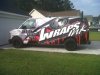
new shop van wrap
- Thread starter Wraps ink
- Start date
phototec
New Member

Typestries
New Member
I think it's excellent, actually. There are not many wraps that actually sell the product. This one succeeds. Wheels are a nice touch. Hanging some copy is totally fine. Let us know how much it boosts your biz, b/c it will for sure.
Dan Antonelli
New Member
Looks good. My only critique is that I wish the phone number was more legible, and there was a web address. And as stated above the word 'signs' feels a little low on the layout. But otherwise name and brand are legible, and eyecatching. Nice!
Dan Antonelli
New Member
On a different note, do you think the left vertical stroke on the word 'wraps' seems like maybe it's not leaning left enough? At a quick glance my brain initially wants to read it 'INRAPS' because the W doesn't look enough like a W.
Could be just me though!
Could be just me though!
Jillbeans
New Member
No I thought that too Dan, you beat me to it.
I read it as Inwraps then had to look at the username to see that it was actually wraps.
That and the W in the oval seeming to have a different slant are the two things that bug me.
Would have liked to see the phone number in light grey or even white.
But other than that I do like it.
Love....Jill
I read it as Inwraps then had to look at the username to see that it was actually wraps.
That and the W in the oval seeming to have a different slant are the two things that bug me.
Would have liked to see the phone number in light grey or even white.
But other than that I do like it.
Love....Jill
jeffr0wland
New Member
I like it! Think it looks good.
Baz
New Member
I think it looks pretty good 
My critiques: Phone number is to small and dark compared to the other text and you don't have enough negative space in that design. The main graphics look to big for the space. Reducing them a little would have went a long way to balancing everything.
Overall i give it an 90/100 rating
My critiques: Phone number is to small and dark compared to the other text and you don't have enough negative space in that design. The main graphics look to big for the space. Reducing them a little would have went a long way to balancing everything.
Overall i give it an 90/100 rating
SignManiac
New Member
On a different note, do you think the left vertical stroke on the word 'wraps' seems like maybe it's not leaning left enough? At a quick glance my brain initially wants to read it 'INRAPS' because the W doesn't look enough like a W.
Could be just me though!
It wasn't just you Dan. That was the first thing that jumped right out at me too. Other than that, its not bad.
Ponto
New Member
that would be a shadow..lol and if you cant read the word ink... Then you probably shouldnt be typing..
+1.......nice work!!!!!!!!!!!!!
Jp
Rage Wraps
New Member
Looks good.
Pat Whatley
New Member
Can we see the other side? Everybody always posts pics of the easy side.
MichaelAlmand
New Member
Dan Antonelli said:On a different note, do you think the left vertical stroke on the word 'wraps' seems like maybe it's not leaning left enough? At a quick glance my brain initially wants to read it 'INRAPS' because the W doesn't look enough like a W.
Could be just me though!
Good call Dan