-
I want to thank all the members that have upgraded your accounts. I truly appreciate your support of the site monetarily. Supporting the site keeps this site up and running as a lot of work daily goes on behind the scenes. Click to Support Signs101 ...
You are using an out of date browser. It may not display this or other websites correctly.
You should upgrade or use an alternative browser.
You should upgrade or use an alternative browser.
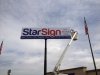
New Sign Going Up!
- Thread starter StarSign
- Start date
SignManiac
New Member
Big sign!
Sign Works
New Member
Big banner.
Moze
Precision Sign Services
won), how is the material hooked two the sign, and too) did you make the pole and iff so what is the purpose of the "telescoping" just for looks or what?
Edna we just used Velcro, we like to change the sign a lot and the pole is telescoping so the next time we can change the sign we can just lower it down and change it without a bucket truck.
These both made me laugh...especially "won)"
Pixels Are Bad Mmmkay?
New Member
If you stand at the top and look down the telescoping pole you can see all the way to the center of the earth.
Gino
Premium Subscriber
If you stand at the top and look down the telescoping pole you can see all the way to the center of the earth.
I was always told you can see China down there. Almost like the light at the end of the tunnel is New Jersey.............

J Hill Designs
New Member
so the post is hidrolick?
yeah most high-rise signs with that type of pole are hidrolick - next time you service one, just ask em to lower it for you

Gino
Premium Subscriber
so the post is hidrolick?
No silly, it's automatic, systematic, hydromatic..... maybe even ultramatic.
D&Tgraphics
New Member
Gino said:No silly, it's automatic, systematic, hydromatic..... maybe even ultramatic.
It sounds like Grease Lightning
Craig Sjoquist
New Member
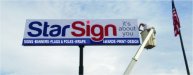
Ok fine .. so a white background against light blue or gray sky's, then copy from edge to edge all 4 sides, only dark panel is small copy on bottom. so kinda a fail for a billboard advertisement.
How to correct next time same ad.
The general layout is good, but a main dark panel against sky with white letters is contrast,
the copy next to main another color panel you can harmonize is good way,
then bottom panel white with black copy would read easy at break neck speeds.
One thing this billboard size is lacking greatly is air space around the copy & simple contrast
What do have is 3 good simple messages, contrast makes the difference during the day, you must see the sign area 1st then the main copy, 2nd copy, then 3rd at bottom.