-
I want to thank all the members that have upgraded your accounts. I truly appreciate your support of the site monetarily. Supporting the site keeps this site up and running as a lot of work daily goes on behind the scenes. Click to Support Signs101 ...
You are using an out of date browser. It may not display this or other websites correctly.
You should upgrade or use an alternative browser.
You should upgrade or use an alternative browser.
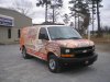
New wrap completed before christmas
- Thread starter SSG_SIGNS
- Start date


All Star Graphics
New Member
I know what they do and how to get a hold of them. Works for me. Should work for them too!
M
MANNING
Guest
B+ Keep Wrapin
zmatalucci
New Member
manufactory?

TheSnowman
New Member
Looks good. Clean, Simple, Effective.
B Snyder
New Member
Looks good. I think the message and content are clear. Here are the nit-picky things I notice.
- I wish the ceramic tile pattern on the passenger side fender matched the hood for a more seamless look.
- It is hard to tell for sure by the picture angles but it looks the hardwood on the rear passenger-side continue on to the back door but the same isn't true on the driver's side. It doesn't matter when looking straight at the side or straight at the back doors but from the angle of the second pic, it looks a bit disconnected.
- The text on the driver-side fender could be more centered on that panel (fender panel). It looks like it might be on the passenger's side but it also might be the angle of the picture.
Those are things I notice but I don't think they make a huge difference. It always seems strange to critique other people's work when I'm never happy with the stuff I crank out. I guess the day we are 100% pleased with all of our designs is the day we should find another profession. Thanks for sharing.
Allen
Craig Sjoquist
New Member
Likes every about this wrap ...except main copy no contrast at all ... blue would have worked ... look at thumbnail the whole van looks orange mainly
it looks nice and readable but not at a distance.. my 2 cents
it looks nice and readable but not at a distance.. my 2 cents
Dan Antonelli
New Member
Likes every about this wrap ...except main copy no contrast at all ... blue would have worked ... look at thumbnail the whole van looks orange mainly
it looks nice and readable but not at a distance.. my 2 cents
I agree with Craig. Main copy probably would have worked better with darker color and then slightly darker orange drop shadow, etc. Sometimes its easy to become too dependent on a white PS glow to pull off using main copy too close in contrast to your BG.
Still is a nice job, but I think swapping those colors would have made it really pop more.
I might have liked to see more planking -
vinylbarry
New Member
Yep Should have ready factory direct becuase manufactory direct reads funny.
But good overall.
But good overall.
chasegraphics
New Member
Looks good...
SSG_SIGNS
New Member
The pics don't do this wrap any justice, if they did you would see in the name & the bullet box they have hardwood floor texture in them and it actually looks very sweet in person.
Thanks for all the comments and critiques. The manufactory was all the customer, I tried to change it but he was stuck on that.
Thanks for all the comments and critiques. The manufactory was all the customer, I tried to change it but he was stuck on that.
Eddie Gallivant
New Member
nice work
trimitbyrich
New Member
very good job. Simple and to the point! this is what they are supposed to look like.