• I want to thank all the members that have upgraded your accounts. I truly appreciate your support of the site monetarily. Supporting the site keeps this site up and running as a lot of work daily goes on behind the scenes. Click to Support Signs101 ...

Newbie Question: Avoiding a 'ridge' when layering vinyl

Rob36

New Member
Hi all.
Im a Stock Car signwriter well versed in using paint/airbrush, but Ive just decided to branch out to vinyl. First job signing a taxi in a single colour of vinyl went V well, but Ive got myself another job signing up another taxi - this time it'll involve layering up using 3 colours.

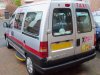
I'll post a pic of the logo I'll be using - My main concern is layering the bordered lettering over the black figure and could do with some advice!
To my limited knowlege I have 2 options:
1. Cut and apply the figure in its entirety (ie including the bit of him that is obscured in the image by the overlapping text)) but this will surely leave an unsightly ridge through the letter D on the finished article).
2. Cut out only what you can see of the black figure, and try and 'match up' the text and figure perfectly - surely quite tricky do because of the backing paper, unless I cut round the shape of the figure after weeding is completed?
I'm sure Im missing a trick, and would love some advice!!
Thanks in advance chaps. Heres the image...
 

Attachments

  • discocabsgraphic.jpg
    discocabsgraphic.jpg
    124.5 KB · Views: 75
Last edited by a moderator:

Drip Dry

New Member
I assume you are putting this on a background other then white, therefore you need to include the shadow.
I would weld both the man and the shadow together. Put that down. Then cut the black man and apply that on top of the white. Do the same for the burgandy letters. Done
 

TyrantDesigner

Art! Hot and fresh.
This isn't a newbie question ... this is an 'I don't understand design' question.
 

Attachments

  • Your-work-done-for-you--you-are-welcome.jpg
    Your-work-done-for-you--you-are-welcome.jpg
    53.8 KB · Views: 81

Rob36

New Member
Thanks indeed for the reply. Yes the taxi is a deep silver colour. I think I'm with you - merge the man and shadow, so the white layer is an outline of the whole graphic, then layer the elements on top of that? I guess I's then need to be very exact when laying down the black man, or I'll get traces of white vinyl around the edge?
 

TyrantDesigner

Art! Hot and fresh.
Really? How does asking for advice in layering vinyl equate to not understanding design? I'm just asking for some friendly pointers is all!

All right, I'll bite ... that is not a disco dancer. that figure is more out of Rent or the 50's zoot suit era than disco ... google is your best friend for reference http://www.google.com/search?q=disc...A&biw=1360&bih=608&sei=RWNJT5rPFa_2sQKfyrCxCA

Second, if you understood designing for vinyl even remotely you would not try to layer vinyl like that and thus your design for it would be different. asking how to avoid that is design 101 ... and you would know that even with painting since you will see the underpainting of the person if layered that way.

third, your font and color choices suck. Not going to sugar coat it.
 

JKADesigns

New Member
Really? How does asking for advice in layering vinyl equate to not understanding design? I'm just asking for some friendly pointers is all!
sorry bud... you're just making yourself look like an idiot posting this on this site... that's kind of one of the things around here that's a "D'OH!".

Quick tip. Layer wet.
 

tsgstl

New Member
Like the previous poster said just remove that section of the guy
if your worried about lining it up cut registration marks with each color and remove them afterwords (if you dont have registration marks use something like the letter x as shown
 

Attachments

  • disco.jpg
    disco.jpg
    67.5 KB · Views: 84

tsgstl

New Member
sorry bud... you're just making yourself look like an idiot posting this on this site... that's kind of one of the things around here that's a "D'OH!".

Quick tip. Layer wet.


don't layer wet, that is a unnecessary step that causes way more problems than it helps. There is uses for using rapid tac but this is not one of them

"D-OH!"
 

Rob36

New Member
All right, I'll bite ... that is not a disco dancer. that figure is more out of Rent or the 50's zoot suit era than disco

Second, if you understood designing for vinyl even remotely you would not try to layer vinyl like that and thus your design for it would be different. asking how to avoid that is design 101 ... and you would know that even with painting since you will see the underpainting of the person if layered that way.

third, your font and color choices suck. Not going to sugar coat it.

More than happy for you to bite mate. I'll justify my choices...
1. Rather than emulate a 70's disco dancer, the silhouette is a representation of the guy who drives the cab - a pal of mine. 'Disco Jon' as he's affectionately known due to his love of dancing to MODERN DISCO & HOUSE MUSIC, actually wears a trilby hat in his cab as he's ferrying around the party people. Also mate we're talking Disco REVIVAL here - how many Zoot guy have you seen wearing a T SHIRT?
2. Agreed. As I've already said I'm new to vinyl. I have no plans to paint it.
3. The font - Perfectly suitable. Again we're not talking 70's disco here! Its for the side of a cab! I feel its a good balance between good visibility and impact and the funky/cheesy image Jon wants to portray. Its going on in burgundy glitter vinyl by the way. Also - it matches the trilby hat Jon wears, which is a similar hue.

HOWEVER!! Not wishing to start things on the wrong foot! Thanks for all your replies! I guess some of you are just having a bad day eh??
 
Last edited:

JKADesigns

New Member
don't layer wet, that is a unnecessary step that causes way more problems than it helps. There is uses for using rapid tac but this is not one of them

"D-OH!"

I've done it both ways. There are advantages to both methods. Wet I seem to get the decals kiss my *** perfect. With registration marks they are always just a tad off.
 

Rob36

New Member
To do this with no layering you will want to try digitally printed with a lamination top layer.

As far doing as you described with cut vinyl, Youtube will supply the best direct answer to your question.

Thanks indeed for the constructive help!
No time to consider outsourcing digital print - the job is imminent, however, the advice given on this thread regarding cutting the disco guy combined with the youtube posts regarding alignment have given me all the pointers I need.

Thanks guys. I look forward to offending you once again - next time I need an answer to a problem. Stay happy - you lot will give yourselves a hernia.:clapping:
 
Last edited:

OldPaint

New Member
i do these type of vinyl all on a single layer. the black is cut thru where the white goes. the white is cut thru where the maroon sets. this way it is only 1 single layer of vinyl.
most sign programs can do this, also corel draw will do this pefectly. set the words ontop ot the white, in hairline, select the whole thing, go to ARRANGE, THEN SHAPING, and in the flyout you will see intersect and cut thur.........been a while since ive done one but this will give you cut out in the white the burganfy letters can sit in.
 

JTBoh

I sell signage and signage accessories.
i commend the noob on his handling of the "welcome to signs 101, now eat sh*t from the old heads" greeting.

well done, sir.
 

striper14

New Member
if i had to do that i would either

a/ put a white outline on the black figure, weld to white o/l round text. This makes alignment very easy or

b/ leave a 1 mil gap between black man & text - looks fine
 

visual800

Active Member
if it were me I would cut the white shadow first then lay down the lettering and THEN lay down the dude making the places where the lettering hit on him be a void.

second I would suggest as other said digital printing it would all be done in one shot and you could make some cool shading in your logo
 

Rob36

New Member
Just like to say thanks for all the advice chaps - and indeed special thanks must go to Tyrantdesigner, who's thinly disguised insult/parody of my design with the added black border actually provided a good workaround. Thats why I registered on here - to pick the brains of those more experienced. The taxi is now done and Disco Jon is tres happy.
 

Attachments

  • disco1.jpg
    disco1.jpg
    66.7 KB · Views: 82
  • disco2.jpg
    disco2.jpg
    64.5 KB · Views: 91
Top