-
I want to thank all the members that have upgraded your accounts. I truly appreciate your support of the site monetarily. Supporting the site keeps this site up and running as a lot of work daily goes on behind the scenes. Click to Support Signs101 ...
You are using an out of date browser. It may not display this or other websites correctly.
You should upgrade or use an alternative browser.
You should upgrade or use an alternative browser.
Newbies only
- Thread starter Dave Drane
- Start date
Dave Drane
New Member
Dave Drane
New Member
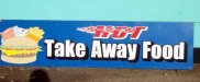
That is an Aussie thing!! Hey Astro, don't ya just hate that when it drips down your arms, or drops out on your white shirt!!.. It was a very poor and faint digital print and it was under cover so the weather could not be blamed. It is supposed to be a group of hot food, hamburgers, fish & chips, milkshakes etc..Where's the beetroot Dave? :Australia
Thank you all for your replies and I would love to see some more "before and afters" done along the same line as I did. It helps people see the different ways the same job can be approached.

omgsideburns
New Member
I've been in the business for about 4 years....does that count?
First off I would make the Old Engligh all caps, and arc it......
Then I would adjust all the kerning to match the distance between the "F" and "o".
I think that would make it perfect.
Oh! and change the "HOT" to brush script.
")
Spot on!
Jillbeans
New Member
I would have done my best not to use their pictorial, that fish head is just nasty looking.
Built this graphic (should have eliminated the cone) from a dingbat font.
I think somehow "hot" clashes with the idea of milkshakes, so I made the secondary copy all one line.
I know "take away" is the UK/Oz term for "to go" so there is no problem with that phrase in my opinion.
I tried to make "FOOD" be what stood out.
I like to add a border when I can, for a finished look.
Not a Newbie, just trying to get geared up to go work on my own sign.
My kerning (I just typed it raw) on the subcopy is abyssmal.
Attachments

Edserv
New Member
Hey Dave, thanks for your kind response. I've been in the sign biz for a whopping 18 months, but in the printing/design industry since 1873. (oops,) 1993. I've gotten a lot of flack here and in other forums for my "newbie" status. But I've really had a lot of experience in business, so my opinion doesn't mean a hill of beans to most people here, but I've had to make pay-rolls for 17 years, so I guess (in my world) my opinion finally means something, simply because if a project doesn't generate profit or cash-flow, nobody's design expertise does much for taking deposits to the bank.
I admire your approach to this project. And I still think the fish head is a bad idea!
Great luck to you, your business, and family!
Aloha,
C
I admire your approach to this project. And I still think the fish head is a bad idea!
Great luck to you, your business, and family!
Aloha,
C
astro8
New Member
And I still think the fish head is a bad idea!
It wouldn't be a proper take-away without the fish head.
(it's an Aussie thing)

signmeup
New Member
Anything wrong with "Take OUT" ?
maybe its an aussie thing?
I think they mean you can't eat on the premises...you have to take the food away to eat it. Like "you don't have to go home...but you can't stay here." Check out this thread post#12. http://signs101.com/forums/showthread.php?t=54495 they don't even have any tables.
signmeup
New Member
Please explain the fish head for those of us who don't know about it.It wouldn't be a proper take-away without the fish head.
(it's an Aussie thing)
Dave Drane
New Member
I would have done my best not to use their pictorial, that fish head is just nasty looking.
Built this graphic (should have eliminated the cone) from a dingbat font.
I think somehow "hot" clashes with the idea of milkshakes, so I made the secondary copy all one line.
I know "take away" is the UK/Oz term for "to go" so there is no problem with that phrase in my opinion.
I tried to make "FOOD" be what stood out.
I like to add a border when I can, for a finished look.
Not a Newbie, just trying to get geared up to go work on my own sign.
My kerning (I just typed it raw) on the subcopy is abyssmal.
Thanks Jill, but your makeover is really good..BUT. as I stated right from the start I had no input as to the makeover. The guy wanted his "logo" apart from how bad it is and all he wanted from me was to make the text look better from the cheapest way he could get out of it. The whole colour scheme was bad from the start. I may post a pic soon from the front of the shop, It was real bad, but as I stated earlier "just take the money and run" on some jobs. In Australia "take away food" just means that.. you go in, order what you want, they wrap it up and you walk ot the door with it. We have different sayings here as I have found when i go to the states.. In aus. in motels we have "self contained units" which to you guys is just a room with all the mod cons where you stay for a week instead of just one night. I love going to the states just to see and laugh about our differences, as Aussies laugh about your sayings, as you do ours. If you told an aussie about "carry out food" he would not understand.
I hope some people enjoyed this exercise and I will do it again if the chance pops up. It will help newbies understand a lirttle about layout and design, and who knows, it may help us "old dudes" too. Sometimes I feel like a dinosaur, but as my mate Si Allen calls himself he is the original Brushasauras!!:ROFLMAO:
Dave Drane
New Member
I think they mean you can't eat on the premises...you have to take the food away to eat it. Like "you don't have to go home...but you can't stay here." Check out this thread post#12. http://signs101.com/forums/showthread.php?t=54495 they don't even have any tables.
The take away food shops have a table inside or outside where you can eat the food you bought there, but one thing I found in the states that we don't do here is, you clean up after yourselves. In Aus. we just leave the crap on the table and walk away, where as you guys put it in the bins supplied inside the cafeteria. We eat outside much more in Australia. One thing I relly miss in Aus. is the Mexican food
dragonfire442
New Member
Dave, this was a great thread! Unfortunately I came in too late before you posted the final product. But I hope you (or someone else) does this again for us new guys...it's great practice and a great way to get critiqued!
Chuck Solid
New Member
...if I were doing it...
In my humble opinion, there are a few things "not quite right". The graphic is kind of overpowering the text. The Text is too lightweight and "bleeds" too far to the right, and as an "Aussie" I think Old English style fonts should only be used in reference to Knights and Castles, not "edibles". (smiles here).
If possible, I would change the font to something more "cartoony" and maybe chubbier. I would change the graphic and have the burger on one side, the fish and chips on the other and the "Hot" text centred above the main text. (try and have your text fill up a bit more of the sign without "crowding")
Regards, Chuck
Hi guys, I want to get some opinions on the sign shown below. I want guys who have been in the business for lets say....up to 3 years only. I have already altered the sign and will put a pic up in a couple of days, but what I want you to do is tell me some ideas of what may look better changing lettering only (it peeled off real easy because it was chep stuff), and also state what you think could be wrong with it now.
Thanks to all who participate and I will post another pic in a few days.
David Wright
New Member
In my humble opinion, there are a few things "not quite right". The graphic is kind of overpowering the text. The Text is too lightweight and "bleeds" too far to the right, and as an "Aussie" I think Old English style fonts should only be used in reference to Knights and Castles, not "edibles". (smiles here).
If possible, I would change the font to something more "cartoony" and maybe chubbier. I would change the graphic and have the burger on one side, the fish and chips on the other and the "Hot" text centred above the main text. (try and have your text fill up a bit more of the sign without "crowding")
Regards, Chuck
Did you see the date of the original post? Not much needed except as a design exercise I suppose.
Mr. Drane died a few years ago.