-
I want to thank all the members that have upgraded your accounts. I truly appreciate your support of the site monetarily. Supporting the site keeps this site up and running as a lot of work daily goes on behind the scenes. Click to Support Signs101 ...
You are using an out of date browser. It may not display this or other websites correctly.
You should upgrade or use an alternative browser.
You should upgrade or use an alternative browser.
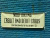
Nice Banner huh!
- Thread starter Knep
- Start date
GypsyGraphics
New Member
gosh, i wouldn't change a thing, i happen to think it's perfectly lovely for you 
J Hill Designs
New Member
Bigdawg
Just Me
As far as banners go... I've seen worse...
and I won't make fun of this one because they at least used a legible font. The message was clear and the contrast was good.
The hanging of said banner sucks... and that says more than the words on the banner do about what is acceptable for their company.
and I won't make fun of this one because they at least used a legible font. The message was clear and the contrast was good.
The hanging of said banner sucks... and that says more than the words on the banner do about what is acceptable for their company.
Pat Whatley
New Member
There was a local company that used to do their banner corners that way. I never understood that....what's that supposed to be accomplishing?
HulkSmash
New Member
Is this one of those famous $10 rental banners?
What's up with the corners?
Love....Jill
saw this coming.
CheapVehicleWrap
New Member
Cheap.
MontereySigns
New Member
There was a local company that used to do their banner corners that way. I never understood that....what's that supposed to be accomplishing?
They folded the corners to hide where they cut them....
-Shawn


Craig Sjoquist
New Member
Well like Bigdawg says you can read it ( from distance picture taken ) and it does have contrast.
Here in Orlando that would be passable, we have alot worse I mean alot worse and not just from one or 2 sign shops how about 20 to 50 sign shops, I could load a gig or more of bad signs in here just in the last few months made that look worse then that.
To prove it I'll go take 2 pictures both sign shops and less then a 1/4 mile away, both have printers and employees.
Geez maybe the 2 will see it and start making better signs would be my hopes.

