-
I want to thank all the members that have upgraded your accounts. I truly appreciate your support of the site monetarily. Supporting the site keeps this site up and running as a lot of work daily goes on behind the scenes. Click to Support Signs101 ...
You are using an out of date browser. It may not display this or other websites correctly.
You should upgrade or use an alternative browser.
You should upgrade or use an alternative browser.
Nice Office Door Sign - Need some suggestions...
- Thread starter neato
- Start date
Robin Canaday
Mythic Signs Portland - General Manager / Owner
Rick
Certified Enneadecagon Designer
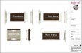
Here's my first idea....
So knee jerk reaction is:
I get that this sign would seem "custom" but like I mentioned before, most - like this idea - is more "stock" custom. But remember, I do this type of sign everyday. It's all acrylic, wood, metal, stand-off's and layers all day long for me.
It is clean...
It is simple...
It may even help sell sign to "your" particular clientele...
So in this case, the design probably works... but to me, it's MEH
-- One real beef I have with every stand-off sign that uses clear acrylic. Crap, dust and cleaning liquids eventually find their way behind the sign and it looks like poop. I suggest painting or frosting the back.
-- Putting it on the door makes the sign ineffective when the door it open. I'm guessing it's open most of the time.
-- If you HAD to put it on the door. You really want to mechanically fasten it as the door opening and closing will make other attachment methods less than ideal
-- Patching a wood grained door is more problematic than patching drywall... the lease may not allow sign attachments to the door. I would attach it to the wall.
Last edited:
neato
New Member
Yeah, I agree. The office staff suggested the door mount, but I agree, I'll talk them into mounting on the wall.
You're probably right Rick, it is pretty standard. But we live in a depressed town of 33,000 in the middle of the midwest, so it'll be as classy and exciting as Olive Garden here
But the frosted look would be better. I like that idea.
I'm going to keep brainstorming and try to come up with something more creative too.
Thanks for all the suggestions!
Rick
Certified Enneadecagon Designer
Olive Garden
Fancayyyyy!
When we got an Appleby's in my one horse town I wore my tux out to dinner...
Rick
Certified Enneadecagon Designer
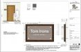
I was at the market when I looked at your drawing, your rendering on the door looked a little off but had no way of telling how far off it was.
When making an architectural or any sign rendering, you really want to make sure your scale/proportion is correct and all your renderings. When I scaled the door on your drawing (looks like a standard 80" x 36") then made a box around the sign you designed, it scales up to 16 3/8" x 9 1/2" - or 33% larger than you are calling it out. When the sign gets attached, and if there is a side by side comparison, the sign will not look correct - even IF you called out the measurements. Always render your drawing correctly as that could be the thing the client will get hung up on.
I make it a habit to draw out the elevation and add a scale person, they way the client (and I) can see if the proportions will work as designed.
Ask I think about this one-off sign I'm about 390 - 450 bucks if you bill at 65-75 an hour (does not include materials)...
Trip charges built in but must be within 10 minute drive
0.5 Hours - Client Meeting
1.0 Hours - Design, Send, Discuss
.75 Hours - Order Materials
3.0 Hours - Fab: Wood, rout, stain, finish, acrylic, cut, polish, drill, cut weed mask paint lettering install details, clean mess, put tools away.
0.5 Hours - Install
.25 Office Misc: Bill, Bookeeping, Misc
You can make 4-6 in that same amount of time.
Last edited:
Zendavor Signs
Mmmmm....signs
These kinds of projects can be such a waste of time. So much brainstorming and researching and designing for what, a $200 sign? I have been recommending customers that have requests like this, assuming they don’t find anything in our own photo galleries, to google search and find images online they like. That helps eliminate a lot of wasted time and gets down to talking price, because there is a big risk in all this that your customer will mess their pants over your quote, assuming you charge properly.
Texas_Signmaker
Very Active Signmaker
These kinds of projects can be such a waste of time. So much brainstorming and researching and designing for what, a $200 sign? I have been recommending customers that have requests like this, assuming they don’t find anything in our own photo galleries, to google search and find images online they like. That helps eliminate a lot of wasted time and gets down to talking price, because there is a big risk in all this that your customer will mess their pants over your quote, assuming you charge properly.
My takeaway from the OP was not that he was trying to make $$ on this order, but that he was trying to cheer up his depressed town... one office door at a time.
neato
New Member
You got it! I don't care if I make a cent on this, just helping a friend out and creating a piece for the portfolio.My takeaway from the OP was not that he was trying to make $$ on this order, but that he was trying to cheer up his depressed town... one office door at a time.
neato
New Member
I was at the market when I looked at your drawing, your rendering on the door looked a little off but had no way of telling how far off it was.
When making an architectural or any sign rendering, you really want to make sure your scale/proportion is correct and all your renderings. When I scaled the door on your drawing (looks like a standard 80" x 36") then made a box around the sign you designed, it scales up to 16 3/8" x 9 1/2" - or 33% larger than you are calling it out. When the sign gets attached, and if there is a side by side comparison, the sign will not look correct - even IF you called out the measurements. Always render your drawing correctly as that could be the thing the client will get hung up on.
I make it a habit to draw out the elevation and add a scale person, they way the client (and I) can see if the proportions will work as designed.
Ask I think about this one-off sign I'm about 390 - 450 bucks if you bill at 65-75 an hour (does not include materials)...
Trip charges built in but must be within 10 minute drive
0.5 Hours - Client Meeting
1.0 Hours - Design, Send, Discuss
.75 Hours - Order Materials
3.0 Hours - Fab: Wood, rout, stain, finish, acrylic, cut, polish, drill, cut weed mask paint lettering install details, clean mess, put tools away.
0.5 Hours - Install
.25 Office Misc: Bill, Bookeeping, Misc
You can make 4-6 in that same amount of time.
Dang it Rick, I didn't even scale it on the door yet, I just slapped it on there. Definitely will fix and add the proper perspective.
There will be NO money made on this sign, but it's not my goal with this one. I'm sure 390-450 is about right, but in all honestly, I'll be more at $175-200 on it, and that's if they even go for that price. But it gives me some practice with a new sign style (for me) and something unique for my portfolio. And I get to step away from the computer, use my hands and tools, get dirty and get out to install it. And maybe have enough left over for a coffee and muffin from my favorite coffee shop which just happens to be next door to the client.
Gino
Premium Subscriber
So, what happens if they REALLY like it and order 4 more, for the other doors ?? How do you explain that ??
The only customer that gets jobs for free is my church, everyone else pays, unless there is a good justified reason not to make any money......... like going fishing.
The only customer that gets jobs for free is my church, everyone else pays, unless there is a good justified reason not to make any money......... like going fishing.
Another thing is, and I think you know this was coming:
Once you identify a room, it becomes a code sign with braille and tactile required. Now, you can have the client sign off any liability on your end and put braille and tactile later if there is an issue... but consider this one thing. You can do one sweet complaint office sign that other business will see, to sell hundreds of compliant signs later. Either way, just thought it was worth mentioning.
Also, if this is a code sign then if I'm not mistaken it should not be applied to the door:
703.4.1 Height Above Finish Floor or Ground. Tactile characters on signs shall be located 48 inches (1220 mm) minimum above the finish floor or ground surface, measured from the baseline of the lowest tactile character and 60 inches (1525 mm) maximum above the finish floor or ground surface, measured from the baseline of the highest tactile character.
EXCEPTION:Tactile characters for elevator car controls shall not be required to comply with 703.4.1.
703.4.2 Location. Where a tactile sign is provided at a door, the sign shall be located alongside the door at the latch side. Where a tactile sign is provided at double doors with one active leaf, the sign shall be located on the inactive leaf. Where a tactile sign is provided at double doors with two active leafs, the sign shall be located to the right of the right hand door. Where there is no wall space at the latch side of a single door or at the right side of double doors, signs shall be located on the nearest adjacent wall. Signs containing tactile characters shall be located so that a clear floor space of 18 inches (455 mm) minimum by 18 inches (455 mm) minimum, centered on the tactile characters, is provided beyond the arc of any door swing between the closed position and 45 degree open position.
EXCEPTION:Signs with tactile characters shall be permitted on the push side of doors with closers and without hold-open devices.
Rick
Certified Enneadecagon Designer
Also, if this is a code sign then if I'm not mistaken it should not be applied to the door:
703.4.1 Height Above Finish Floor or Ground. Tactile characters on signs shall be located 48 inches (1220 mm) minimum above the finish floor or ground surface, measured from the baseline of the lowest tactile character and 60 inches (1525 mm) maximum above the finish floor or ground surface, measured from the baseline of the highest tactile character.
EXCEPTION:Tactile characters for elevator car controls shall not be required to comply with 703.4.1.
703.4.2 Location. Where a tactile sign is provided at a door, the sign shall be located alongside the door at the latch side. Where a tactile sign is provided at double doors with one active leaf, the sign shall be located on the inactive leaf. Where a tactile sign is provided at double doors with two active leafs, the sign shall be located to the right of the right hand door. Where there is no wall space at the latch side of a single door or at the right side of double doors, signs shall be located on the nearest adjacent wall. Signs containing tactile characters shall be located so that a clear floor space of 18 inches (455 mm) minimum by 18 inches (455 mm) minimum, centered on the tactile characters, is provided beyond the arc of any door swing between the closed position and 45 degree open position.
EXCEPTION:Signs with tactile characters shall be permitted on the push side of doors with closers and without hold-open devices.
There are so many code related things wrong with the sign that my hand would cramp up with all the copy and pasting... over here in California, we finally have a reprieve on the lawsuit happy ADA lawyers where we have a certain amount of time (120 days) to fix any issues with an ADA issue. I think Illinois has the same fine as we do, but I don't think they have a time allowance to make a sign compliant.
GAC05
Quit buggin' me
Rick how big does the Prop. 65 warning against eating the sign need to be on each one?There are so many code related things wrong with the sign that my hand would cramp up with all the copy and pasting... over here in California, we finally have a reprieve on the lawsuit happy ADA lawyers where we have a certain amount of time (120 days) to fix any issues with an ADA issue. I think Illinois has the same fine as we do, but I don't think they have a time allowance to make a sign compliant.
Rick
Certified Enneadecagon Designer
I was brought back here by an email notification and noticed another boo-boo on your drawing (the side view).
Another thing is, the overall sign may be 12" but in actuality, the type area is only 10 1/2"... it may be a little small for the type of sign it is.
Side views on a dimensional signs are almost as important as the elevation. Occasionally you find that the side view is not all that appealing... I also thought while I was playing with it, I would take 30 minutes and come up with variations using aluminum/green glass acrylic and wood veneer...
I was assuming that you are trying to build up your portfolio, but as I noticed a while back you have a side hustle, you can make a few blanks with the cash you are making, then sell them on your site and make up the costs/labor. I've started my side hustle from the hundreds of logos, wraps and signs I have designed here (a lot I never showed) as well as the thousands I have done over the years - along with ads, invites and brochures. Even complete apartment signage packages. You probably have a stockpile of gold waiting to be sold...
Attachments
My bigger thought on a project like this is the idea of "custom" everything. When you're building 50-500 pieces, custom is fine. On these small jobs, custom kills the price point. For example, if you take that walnut board and switch it to 9x12, you now can buy a stock walnut plaque board. Change the edge finish from "flame polished" to "laser cut" and you've taken another step out of the process. Change the applied letters to engraved and now you've saved another step or switch from 1/16" to 1/32" material and you've saved the step of adding adhesive backing to the 1/16" material. Minor tweaks but would save steps and time in the production process.
I get the idea of letting your creative juices flow and make something interesting. I also think there is value in saying to yourself "Let's make a really sharp looking item that also is an effective option for a 10 piece job".
For example, with just a laser cutter, a drill, and no real other tools, I can make the walnut stand off sign for reasonable price if you make the changes I've noted above. With the way it's spec'd, it would increase the price probably $100-150 and I'm ultimately not sure you're getting any actual value out of that additional money.
Just a little food for thought from a guy that does a lot of crappy small run jobs.
signbrad
New Member
Here's my first idea....
Looks good. Symmetrical layout has a traditional look. The backplate could easily be Corian, which comes in many colors. Looks good clear coated. The nonglare layer works well, and is changeble.
We do hundreds of signs each year for a number of hospitals, office buildings, and school districts. Corian can be rotary engraved, laser engraved, sandblasted, or left as an unembellished layer. It can be machined on the router to create window openings for front-loading or side-loading inserts. We have inlaid two Corian colors with each other, which is a little trickier. We use lots of nonglare acrylic and Chemetal laminates, and tons of the machined standoffs.
Corian can break when dropped. Keep that in mind. Corian is heavy, so double face tape mounting can fail. Better to add silicone to a tape mount. Screws can also crack it.
We have used Takeform and ASI sometimes for design inspiration. There are probably other sources, too.
Brad in Kansas City