-
I want to thank all the members that have upgraded your accounts. I truly appreciate your support of the site monetarily. Supporting the site keeps this site up and running as a lot of work daily goes on behind the scenes. Click to Support Signs101 ...
You are using an out of date browser. It may not display this or other websites correctly.
You should upgrade or use an alternative browser.
You should upgrade or use an alternative browser.
Opinions Please on Natural Camo
- Thread starter Fred Weiss
- Start date


Pat Whatley
New Member
and less poison ivy.
Fred Weiss
Merchant Member

Shovelhead
New Member
better with less leaves....now less middle layer to show more bark.
Fred Weiss
Merchant Member
By middle layer do you mean the branches or the camo fabric?
Shovelhead
New Member
the fabric Fred...I didn't even notice the branches.
Fred Weiss
Merchant Member

SignosaurusRex
Active Member
The branches and twigs don't have a natural placement look to me. More angle to them would help. just my .02
Last edited:
Former member
New Member
Shovelhead
New Member
The branches and twigs don't have a natural placement look to me. More angle to them would help. just my .02
yup...they looks placed....with that revision, bellissimo Fredo.
Fred Weiss
Merchant Member


Former member
New Member
Much Better!

weaselboogie
New Member
I think you need to get rid of that bright leaf and that vertical branch.
SignosaurusRex
Active Member
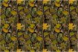
Much better. The vine maple leaves still look too patterned. Needs to be a bit more random appearance. Ya, I know, not so easy to achieve in a tile. Maybe a little varigation in the vine maple leaves might subdue boldness. Some slight redness in one of the species and a darker green in another might help. Are the species colorations all matched to one season for realism? Just a thought.
I agree about the yellow leaves, I don't think you should have singular elements with such sharp contrast sot that when tiled, they form a row or column of contrasting elements. Your first post was actually much better in this regard, though looking a little contrived, but better mix of color.
Replicator
New Member
much better in post #12
Fred Weiss
Merchant Member
Thanks for the input everyone. We ended up with a series of eight varied images .... different bark, different camo fabric, different leaf color, each in the same layout. They will be part of our upcoming Plotter Art™ Seamless Texture Tiles Volume Two soon to be released. They will also be available at ExpressClipart.com in the near future for individual purchase and download.
Attached are low resolution versions.
Attached are low resolution versions.
Attachments
-
 sample_natural_camo01.jpg109.9 KB · Views: 145
 -
 sample_natural_camo02.jpg93.1 KB · Views: 160
 -
 sample_natural_camo03.jpg101.6 KB · Views: 149
 -
 sample_natural_camo04.jpg107.4 KB · Views: 150
 -
 sample_natural_camo05.jpg103.8 KB · Views: 151
 -
 sample_natural_camo06.jpg102.5 KB · Views: 150
 -
 sample_natural_camo07.jpg113.3 KB · Views: 174
 -
 sample_natural_camo08.jpg95.5 KB · Views: 172