-
I want to thank all the members that have upgraded your accounts. I truly appreciate your support of the site monetarily. Supporting the site keeps this site up and running as a lot of work daily goes on behind the scenes. Click to Support Signs101 ...
You are using an out of date browser. It may not display this or other websites correctly.
You should upgrade or use an alternative browser.
You should upgrade or use an alternative browser.
Opinions Please
- Thread starter rjpjr
- Start date
omgsideburns
New Member
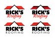
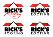
Bottom Right.
showcase 66
New Member
From teh thumbnail, the bottom right is the one that is easily seen. I would go with that one.
thewvsignguy
New Member
 bottom right
SignManiac
New Member
Bottom left for me after scrutinizing for several hours. It was a carefully thought out decision that I can live with.
rjpjr
New Member
Thanks!Nice layouts RJ.
Thanks for your dedication and time invested!!! I was leaning that way myself.Bottom left for me after scrutinizing for several hours. It was a carefully thought out decision that I can live with.
Bottom right IF he specializes in metal roofing. If he does all types bottom left.
Metal roofs is the first thing I thought of looking at it.
This is what I what I was concerned with. I had already made some changes, but I am not sure I like this direction either. I am concerned the changes will be perceived as a Tile roof.
More thoughts and opinions would be appreciated. Thanks again.
Attachments
QualitySigns
New Member
Try "RICK'S" in the script font and "ROOFING" in the bold sans serif font. It seems to me that the word "ROOFING" is more important than "RICK'S." Just a thought.