• I want to thank all the members that have upgraded your accounts. I truly appreciate your support of the site monetarily. Supporting the site keeps this site up and running as a lot of work daily goes on behind the scenes. Click to Support Signs101 ...

Our company van wrap design - Go ahead, tear it apart

SignProPlus-Chip

New Member
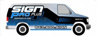
I really want to get this right before we print and wrap out van.

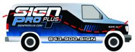
I want our company colors, blue, black & white. A little texture to make it interesting etc...

So go ahead, give me some constructive feedback so I can make this better. I can design the hell out of a lot of this, but my vehicle wraps can use some spit and polish. ;)

FYI since the image is smallish...the top is a brushed metal texture, and the bottom kind of like a sci fi hull texture.
attachment.php
 

Attachments

  • spp van wrap.jpg
    spp van wrap.jpg
    64.8 KB · Views: 155
attachment.php

I like the size and placement of the logo and phone, although I tend to think web addresses are better than phone numbers for vehicle advertising these days.

As far as the layout, you have a van with geometric lines as well as a logo with geometric lines, and a background with geometric lines. If the background stripe flows in a smooth organic shaped figure S, it will add more visual contrast between the elements creating a more dynamic layout. It will also lead your eyes from the logo to the phone number in one quick glance.
 

Attachments

  • Sign pro.jpg
    Sign pro.jpg
    686.9 KB · Views: 142

visual800

Active Member
I guess Im old skool. IMO go with your logo and a phone number and get rid of all that blue and black striping. not bashing your work I just feel that "WRAPS" cause people to fill up vehicles with junk to take up space. I like clean and simple myself
 

Attachments

  • ford-e250-2.jpg
    ford-e250-2.jpg
    24.5 KB · Views: 127

SignProPlus-Chip

New Member
While I would love something more simple, there are two major considerations.

1. We want to showcase that we sell wraps...having our own van wrapped is the best way to do this

2. The current condition of the body of our van...well, let's say a wrap would clean it all up nicely.

I guess Im old skool. IMO go with your logo and a phone number and get rid of all that blue and black striping. not bashing your work I just feel that "WRAPS" cause people to fill up vehicles with junk to take up space. I like clean and simple myself
 

SignProPlus-Chip

New Member
Not when it's blurry like this, no....LOL

The logo is as big as I can comfortably go, and the number is almost 7" tall. Visibility is fine IMO. I don't expect people to view it from half a mile away.

I do think the blue on the bottom can go a little lighter to contrast it from the black strip though...just a touch.


attachment.php


Squint test work?
 

nikdoobs

New Member
Whats going on in the lower light blue section? It looks like a bunch of squares. I don't think it looks bad I just cant tell what it its.
 

SignProPlus-Chip

New Member
Whats going on in the lower light blue section? It looks like a bunch of squares. I don't think it looks bad I just cant tell what it its.

"the top is a brushed metal texture, and the bottom kind of like a sci fi hull texture."

Just something subtle and abstract to break up the solid blue
 

ddarlak

Go Bills!
I can't quite pinpoint my reasoning, but I hate it...

I don't think it is a good showcase for vehicle wraps, the design wouldn't inspire me to hire you to wrap my vehicle.

Being a sign company that sells wraps, I think you have to knock it out of the park or don't do it at all...
 

Billct2

Active Member
I'm with JS, the stripe doesn't flow, and the graduated lines on the door are kinda random.
Other than that I like it.
 

shibby

New Member
I would ditch the blue dashes on the door and add a second smaller logo, along with your company information (address, phone, website, etc). You want people stopped at traffic lights to be able to glance over and see all that info, as that's the best time for them to have a spare (safe) moment on the road to get all your info, or snap a picture of your door. Otherwise, people sitting even with your car in the next lanes can't see any of your info since it's all located on the rear and bottom panel of your van.

just my two cents. personally, i like the overall style of the wrap, could use some tweaks....but like others said, i can't quite pinpoint what i would change about it
 

Jester1167

Premium Subscriber
Unless you're positive your printer can print perfect greys and grey gradients viewed on a cloudy and sunny day, get rid of the greys.

Early in your design process layout the art on both sides of the vehicle. Sometimes things don't look quite right on the opposite side of the vehicle, especially when the text is slanted.
 

OldPaint

New Member
WHY THOSE KELLER COMBINATIONS??? really not good for a "showcase" of your work. 1st of it shows you cant design something THAT WILL POP........GRAB ATTENTION .....PULL THE VIEWER IN TO READ IT.......
BLACK AND BLUE..........YUK... if you gota do this move to a process BLUE.......and i to am old school.......simpler is better, but.........do your text and add some kinda graphic away from the text.......to show you can do graphics.........most wraps are so filled with background the text is unreadable.....
you need to look at DAN ANTONELLIs work, he does wraps and so does BERT QUIMBY........copy their work......at least use some of their vision in your layout.
 

Craig Sjoquist

New Member
I like the readability of your logo brand, dot com, & phone

What bothered me right off was the design of the strips that made me look at that instead of copy & it was just plain boring

I agree with Simply Signs 100% it needs contrast to flow meaning if everything is square use round Think that is why it is being picked apart for small things, eyes are seeing something but hard to place, you have a flow work with it & soften up the eyes by making a wave with colors.

Thinks you are on the right track Ya just need to make it more dynamic
 

SignProPlus-Chip

New Member
Already laid out both sides and the back....this is the problem side. No problem with grays on the HP latex.


Unless you're positive your printer can print perfect greys and grey gradients viewed on a cloudy and sunny day, get rid of the greys.

Early in your design process layout the art on both sides of the vehicle. Sometimes things don't look quite right on the opposite side of the vehicle, especially when the text is slanted.
 

Jillbeans

New Member
I agree about the need of something smooth behind the logo, as has been suggested. Also agree with website vs. phone number.
What bugs the hell out of me in your logo is that Pro looks really awkward.
I dislike the large P because it makes the RO look weird and kinda smashy/disproportionate.
I'd personally make Pro in a killer script.
Or make PRO all the same height.
I can see that you did it to offset/balance the + sign and make a nook for more copy, but I really think it looks cheesy. I don't like the N in sign, and I can see why you did that too, but I would have gone caps & lc rather than having that N. That might have taken away the "techhy" look though.
As for the rest, it's a wrap, and they mostly all look the same to me. The texture thing is a way of showing clients what you are capable of, though. How is the flow on the other side?
Love....Jill
 

jcuminale

New Member
something's missing

for those saying something's missing, but not sure what…and take this how you will, it does not say anything about wraps. some will get it, and some won't, but if it is who you are marketing to…you may want to tell them.
 

rjssigns

Active Member
If it was for our shop I'd wrap the whole thing with a Juice Drop background in green, red or blue. It would certainly get attention.

I see DigitalJuice just went all subscription on us. Seems the "drops" I have are from an ancient collection and no longer available.
attachment.php


Picture is from a rear engine dragster partial. Juice Drop background with rendered strakes. Right and left sides and top of body are shown. Wing was done later.
 

Attachments

  • cropped Juice.jpg
    cropped Juice.jpg
    112.9 KB · Views: 124
Top