• I want to thank all the members that have upgraded your accounts. I truly appreciate your support of the site monetarily. Supporting the site keeps this site up and running as a lot of work daily goes on behind the scenes. Click to Support Signs101 ...

Our latest wrap on our shop truck.

signsfortmyers

New Member
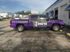
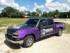
We wrapped the cab in 1080 matte black, and the bed and front fenders with digitally printed 180cv3 with 8548 laminate. where the matte squares extend onto the printed section is die-cut overlay of matte black, and vice versa on the cab and hood. Logo and text were added over the matte in gloss. The picture doesn't do much justice to the extreme contrast between the gloss and matte, but trust me in person it pops.
 

Attachments

  • 9898_293011944171707_2122873247_n.jpg
    9898_293011944171707_2122873247_n.jpg
    92.4 KB · Views: 83
  • IMG_4367.jpg
    IMG_4367.jpg
    540.5 KB · Views: 87

Locals Find!

New Member
Nice work. Welcome from Just over the Bridge!

Shoot me a PM, I would love to be able to send you the wrap work I get asked about from time to time. I don't like dealing with it.
 

2B

Active Member
very clean, easy to read with good contrast.

the gloss/matte combo always makes graphics/designs pop and you did it very well indeed!
 

nikdoobs

New Member
I bet that does look good in person. I'm about to do a wrap a motorcycle in matte black with metallic gold accents (saints theme). my intention is that the gold will really pop on the matte black. Who Dat!
 

Locals Find!

New Member
Hey I just realized I recognize the area your shop is in. I did the design for the window graphics for American Kitchen & Bath Gallery in that same area.
 

Kentucky Wraps

Kentucky Wraps
Love it. Clean, not too busy, but not boring either. It's engaging but not "Xtreme" lol
Only thing is...I still can't figure out what the square part of the logo is all about.
 

Kentucky Wraps

Kentucky Wraps
SFM = Signs Fort Myers I'm assuming.....

I think it looks awesome. When I get a new truck in February I want to do something similar - which showcases what can be done cleanly without going crazy with stupid fills and things that don't compliment the design whatsoever.

Nice work! :thumb:

It didn't jump out as SFM to me. I see it now after looking longer for the S...but the F is made with that little line...when I thought the F was the larger purple part on the left.
Wrap design is awesome for sure.
 
Top