• I want to thank all the members that have upgraded your accounts. I truly appreciate your support of the site monetarily. Supporting the site keeps this site up and running as a lot of work daily goes on behind the scenes. Click to Support Signs101 ...

Question Outsourced Job Headaches

rossmosh

New Member
Most of my headaches come from outsourcing decent sized jobs. Any thoughts on this one?

Early fall 2023, a new customer wants a large stainless tile etched (about 2ft x 4ft). I find a new supplier because they'll etch deeper than the usual ones I deal with and I don't think 1/32" is deep enough. Supplier is extremely reputable and professional.

Over the next 4 months, we work through the project sporadically. They had a designer send over artwork. I put it on a stainless texture, do a quote. Don't hear back. Then get a revision. Then get a request for me to do a revision. Then get a "full" revision. Then get a request to do a text revision. They were small changes and not a big deal overall.

Finally gets approved. Finally get a deposit. Gets sent to my supplier. About 6-7 weeks later we get pictures of the finished product. To me, it looks exactly how I'd expect it. Overall good stuff.

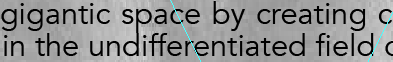
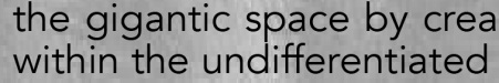
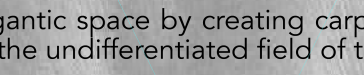
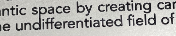
Customer disagrees, says it's a problem. The text is touching in several spots. So I review the artwork and they are correct. They are touching. But I look at the artwork they supplied and the text is either touching or EXTREMELY close to touching. I don't even think about it because it's just obvious that from day 1, that's the design. With that said, the font has gotten bolder through the etching process and there are a few spots I personally think they could have done a bit better with. So I'd say it's like a B+/A- job. Not 100% perfect, but definitely within industry standards.

I also follow up with a phone call trying to get the low down from my supplier. They say they saw that issue. They worked through it and they felt the touching was basically inevitable because of the design, which I don't disagree with. My only point of contention is I wonder if they could have inset the letters to take these issues into consideration or simply called me while they were working through this problem. I run into similar problems on the laser all of the time and often inset or offset letters to take this sort of thing into consideration.

I speak with the customer and play both sides of the fence and they're original talking point is "We can't accept this like this with the letters touching." I tell them that the spaces they see are .02" or thinner and when viewing the proofs even the letters look essentially to be touching. I basically leave it open ended that I'll work on whatever they want and I see their point, but in many of the circumstances, it was inevitable based on their design. They left it as something they have to discuss internally.

I've attached photos of what I'm referring to. 3 of the Illustrator file. 1 of the real product.
 

Attachments

  • 50percent.png
    50percent.png
    15.3 KB · Views: 203
  • 100percent.png
    100percent.png
    27 KB · Views: 107
  • 200percent.png
    200percent.png
    68.2 KB · Views: 101
  • RealProduct.png
    RealProduct.png
    286.8 KB · Views: 111

CanuckSigns

Active Member
I feel your pain on this one! we do tons of plaques and while 99% of them go without a hitch, there is always 1 or 2 a year that end up like this. I can see both sides of the coin, the spacing is extremely tight in the proof. the etching process eats not only down but also outwards, so letters always become a bit bolder, if your new vendor does deeper etching, this issue would also be amplified.

Has your vendor offered you any solutions? We use Gemini for these and they would most likely catch the issue ahead of production. or they would offer a discount on the remake.

i do think your client is being too picky, sometimes they need to step back and think "if I didn't know this was an issue, would I ever see it?"
 

rossmosh

New Member
I've done these sorts of projects through Gemini and had them quote it out but I didn't use them because they didn't passivate, wouldn't etch deeper, and were more expensive.

I also have an etched SS panel in my shop that Gemini got wrong in a similar way. Everything was blown out, especially some details on the logo.
 

CanuckSigns

Active Member
is there any perticular reason your client/you want a deeper etch than Gemini offers? stainless steel, even etched to 4-5 thou will still last outdoors in most environments for hundreds to thousands of years, even when the paint wears out.
 

rossmosh

New Member
Gemini said they wouldn't even promise a 1/32" etch. I have a few samples of their work and the paint is basically at surface level. Since this is a floor tile, there's no way the paint is surviving with regular traffic under those circumstances. Putting it a little deeper it should last longer. Also if they wanted to refill it at a later date, they could mask off the area, paint, and ROS the finish and get multiple refinishes out of it. With a 1/32" or less etch, I'm not sure you could get one refinish. So then you're left flood filling that many letters which is a lot of work.

Gemini also offered a worse warranty and I might be wrong, but I'm also not sure if they could etch the 3/8" panel. I know we were close to maxing out their tanks if I remember correctly.

EDIT: I should add the customer did end up approving the job about 15 minutes ago which is a bit of a relief.
 

rossmosh

New Member
As I said, I didn't design the copy, pick the layout, or pick the font. They sent me something from their designer, that had already gone through approval stages. I assumed they were okay with it / liked it.

5-10 Years ago, I'd mention the problems and try to work with them. Now as soon as I hear they've done approval processes and a designer is involved, I just shut up and do what they want. They've paid someone to do the design stuff. If they wanted me to do the design, they could have sent me the raw text file and I would have done the layout for them.
 

Zendavor Signs

Mmmmm....signs
These kinds of situations are tough. You can have all the CYA's in place, but if your customer is not happy, it is best to work through a solution to make them happy. Not saying roll over, but be accommodating and try to work with your vendor to see if they will eat part of the cost.
 

MrDav3C

New Member
I think there has to be a point where you inform your client of potential issues and that the letters will we expanded, bolder and inevitably closer together prior to sending the job to production. This way the client is aware and has the opportunity to have the artwork ammended or at least you have covered yourself if they don't like the end result.

Saying that I totally understand that some customers can be extremely hard to please and some even look for a reason to complain simply in the hope they can get costs reduced / discounted.
 

rossmosh

New Member
It doesn't match what you sent, shouldn't matter why, that's part of what you pay them for.
I partially agree with this, which is why I told my customer I felt there were parts I definitely felt the letters didn't need to touch. I don't want to question their policies, but for me, I'd inset all of the copy .015" or something like that to take this into consideration. They might have already done that. So I agree that this isn't an A+ job. But I've received and seen much worse at the same time and it's in-line with a majority of what I receive and see when out and a bout. Ultimately, I do think this falls on a design issue more than anything else.

These kinds of situations are tough. You can have all the CYA's in place, but if your customer is not happy, it is best to work through a solution to make them happy. Not saying roll over, but be accommodating and try to work with your vendor to see if they will eat part of the cost.

I think there has to be a point where you inform your client of potential issues and that the letters will we expanded, bolder and inevitably closer together prior to sending the job to production. This way the client is aware and has the opportunity to have the artwork ammended or at least you have covered yourself if they don't like the end result.

Saying that I totally understand that some customers can be extremely hard to please and some even look for a reason to complain simply in the hope they can get costs reduced / discounted.

I told my customer if they didn't like it still after discussing it with them, I'd do whatever they asked to make it right. I explained the result was the letters were essentially touching in the artwork which is essentially what they received. I told them there were parts I didn't think were done as well as they could have been as well. I gave my honest assessment of the situation but backed if they wanted to do something more about getting is changed/fixed because I saw their point.

The one thing I'll say is, I honestly thoughts the letters would be a bit less bold than the end result. These aren't small letters. The upper case are about .59"H. I expected the masking/etching to be able to modified a bit more to make it match a little closer to the artwork provided. On tiny stuff, it's one thing, but decent sized letters I expected a little less growth.
 

MrDav3C

New Member
Perhaps your supplier should have also been more transparent and provided you with more information on how the end product would look different when compared to the artwork
 

Texas_Signmaker

Very Active Signmaker
Important info is missing...

How much did you sell the signs for? How much will this cost to redo? Would you break even? What amounts are we talking about here? Those are the important questions.

If you're going to redo and break even for a new client you think will be a repeat, take the lick and lesson learned. The wholesaler's responsibility is limited..that's why we get it at wholesale rate. It's your responsibility to look over orders and make sure it's being done right...you need to add some value other than just being a broker...ain't that why they are going though a sign guy (or gal)?
 
Last edited:

damonCA21

New Member
It doesn't look good, but to be honest on a floor tile nobody is ever going to look at it or read it anyway! Easy fix would be to paint a thin metallic silver line where the letters touch. Bear in mind the closest this sign is likely to be viewed from is 5 feet ( if someone is standing directly above it ) but more likely 10 - 15 feet, nobody is ever going to know.
 
Top