-
I want to thank all the members that have upgraded your accounts. I truly appreciate your support of the site monetarily. Supporting the site keeps this site up and running as a lot of work daily goes on behind the scenes. Click to Support Signs101 ...
You are using an out of date browser. It may not display this or other websites correctly.
You should upgrade or use an alternative browser.
You should upgrade or use an alternative browser.
Page layout Coreldraw 2019
- Thread starter marunr
- Start date
That's a new one. At the CorelDRAW Community forums I've seen numerous complaints over how CorelDRAW 2019 handles multi-page documents. There appears to be a bug causing CorelDRAW 2019 to re-order pages into odd places. It doesn't seem to happen with short documents under 5 pages. But longer documents get affected by it, causing quite a bit of heartburn with users. It's yet another reason why Corel's "upgrades are ending" ploy seems really really rotten.
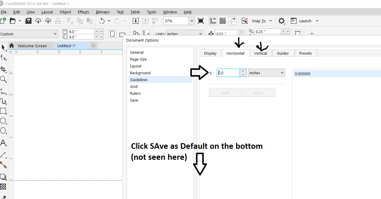
Thanks, but I have it at 0,0. It doesn't seem to matter.It's just a setting in the Rulers dialog box under Page Layout (Origin). Then once you have it back to 0,0 make it your default.
Did you make it your default? If you don't, then every new layout will have the other numbers.Thanks, but I have it at 0,0. It doesn't seem to matter.
It seems to work as long as I open the default page size and then resize the page. Maybe this is the way previous versions have been because in all of my previous versions CTRL N created the default page size, but this version allows me to set the page size when I hit CTRL N. AS long as I stick with the default and then resize it I'm fine. Thanks for the help.
Robert Hunorkpa
New Member
Hey Guyz I did a tutorial on logo design from scratch with coreldraw,
please check it and tell me what you think
myront
Dammit, make it faster!!
Hey Guyz I did a tutorial on logo design from scratch with coreldraw,please check it and tell me what you think
1. Why music and not a narrative step by step? Bad music at that!
2. Step 1 is unnecessary. If you set your default to just start a new page then resize via the input box
3. Stop with the overuse of guidelines
4. guessing on the placement of the guidelines will make for many inconsistencies. Could design left haf then duplicate and flip to the right and weld together so each half is exactly the same.
5. "Treat all objects as filled" turned on - hate it! First thing I turn off.
6. Did you seriously copy and resize (5min mark) to create the center! Another inconsistency. Best to use the contour tool unless of course the effect you got was desired to be so.
7. I, for one, find it very distracting to have all shapes in the Objects docker viewable. All the tools you need will be on the top toolbar (shaping etc) or via keyboard shortcuts
8. right-click on color docker to remove outline. No need to select 1 at a time select both (alt-drag across a piece of each) right click on X in the color docker.
9. You don't have snap to guidelines on?
10. Convert to curves is already on the toolbar also cntl+q no need to go digging
11. with the shape tool selected right-click on any straight line and choose "To curve" less mouse movement.
I can't watch any longer. Way too many "wrongs". Make it stop!
By chance are you "Adobe trained"?

