-
I want to thank all the members that have upgraded your accounts. I truly appreciate your support of the site monetarily. Supporting the site keeps this site up and running as a lot of work daily goes on behind the scenes. Click to Support Signs101 ...
You are using an out of date browser. It may not display this or other websites correctly.
You should upgrade or use an alternative browser.
You should upgrade or use an alternative browser.
Pan Face
- Thread starter slappy
- Start date

Marlene
New Member
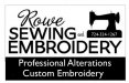
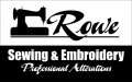
If i do #3 the sewing/embroidery is almost 9" tall and #4 it's 5.5"
being larger can't hurt but it is more about having to search around the layout to find out what they do. #3 is better to me as I saw it right off and the next thing I saw was the little slanted boxed area below that told me more that they do custom embroidery and alterations. since people are driving by, it seems like that is what you would want to see first as the who and phone number will only be important once the customer sees that the business does something they need done.
nwsigns
New Member
What you really need to do is prioritize your copy. What do you want to be read first, second, etc. I like iconic graphics since you dont need to read the sign but simply recognize it quickly. If they have a developed logo and use it to create brand recognition then I would make that the largest but for most small businesses the number one thing is "what do you do?" and the name is really not that important unless its already established with a good reputation and moving.
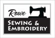
 2 seems like it's missing something somewhere.. dunno
signcrafters london
New Member
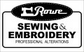
Phone no. has to go, regardless of what you do. It's unnecessary and it's killing your layouts. Too much information. Who. What. Where. That's it. That's the list. And you don't need Where on this one.
Marlene
New Member
Phone no. has to go, regardless of what you do. It's unnecessary and it's killing your layouts. Too much information. Who. What. Where. That's it. That's the list. And you don't need Where on this one.
agree. I'm guessing that the customer is insisting that it be there. try putting it in the base of the sewing machine so it is there but doesn't add a whole lot to the layout. then you can expand the custom/alterations
")
signmeup
New Member
Your customer is no doubt asking for all the dross on this poor sign.
From the description of the sign's location it needs to be kept uber simple. Nobody driving by will have time to read all that.
Most people would figure out that they do sewing and embroidery if you put "sewing and embroidery" on the sign. No need to have it on there twice.
I'd make it bold and simple so it could be read from down the block.
Attachments
SignManiac
New Member
Agree with SignMeUp 100%
None of your layouts are effective for a lighted sign cabinet. What you offered was a business card blown up to fit on a sign. You will have to educate this client and get it through his/her head that less is more, especially for a road sign.
None of your layouts are effective for a lighted sign cabinet. What you offered was a business card blown up to fit on a sign. You will have to educate this client and get it through his/her head that less is more, especially for a road sign.
SignManiac
New Member

Bradster941
New Member
Your customer is no doubt asking for all the dross on this poor sign.
From the description of the sign's location it needs to be kept uber simple. Nobody driving by will have time to read all that.
Most people would figure out that they do sewing and embroidery if you put "sewing and embroidery" on the sign. No need to have it on there twice.
I'd make it bold and simple so it could be read from down the block.
Bingo.
Up to your post signmeup I couldn't understand why people were trying to put the copy on twice.
.
ROWE
Sewing
And
Embroidery
Professional
Alterations
Of the above words, which one(s) are not needed?
If they don’t make complete dresses or suits, then Sewing is not needed.
Alteration should be used only. Besides, you already have a graphic of a sewing machine.
ROWES
PROFESSIONAL
ALTERATIONS
AND
EMBROIDERY
You could also drop the "AND".
Just my thought on the copy.
Last edited: