• I want to thank all the members that have upgraded your accounts. I truly appreciate your support of the site monetarily. Supporting the site keeps this site up and running as a lot of work daily goes on behind the scenes. Click to Support Signs101 ...

Papyrus be gone

Colin

New Member

Attachments

  • Papyrus.jpg
    Papyrus.jpg
    110.5 KB · Views: 44

bob

It's better to have two hands than one glove.
That thing looks like a type face designed by one of the plethora of devoted amateurs and practitioners of aggressive mediocrity at one of the free font sites. I'll give you good odds that the thing, the only thing, that caught your attention was the distress treatment.

Papyrus is an attractive type face, it's only problem is that everyone and their dog uses it for everything. It's a specimen face, not to be used and abused as it has been. If you want something with the same flavor as Papyrus but not Papyrus, try Tempus Sans. At least that's what it's called in these waters. Much better than that Wheat thing.Tempus Sans has some soul, Wheat does not.
 

phototec

New Member
Just because so many armatures and so called bad designers have misused Papyrus doesn't mean there is not a use for the font.

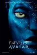
Take the movie Avatar, using a slightly modified Papyrus in all caps with extended tracking, it worked great for the title of the film.

I'm proud to say I am NOT a sheep and don't jump off a cliff just because everyone else does, as a graphic designer for over 25 years I have used 1000's of fonts, even Papyrus and think you can use any font as long as you know when and how to use them. The trouble is that MOST people don't have the design knowledge to know when or how to use certain fonts, and then a font gets a bad rap and all the sheep jump on the band wagon, saying it's BAD.

David Cameron spent a half a billion $ on Avatar, and I'm pretty sure he spent a nice chuck on the graphic design and marketing budget, with that kind of money he could of used any font ever invented, yet he chose to use a slightly modified version of Papyrus, one goal of a designer is creating graphic elements that are appealing to the target audience and if you review the success of the movie, that goal was met.

I think that Papyrus worked well in this case - Don't be a sheep, think for yourself!
 

Attachments

  • avatar-papyrus.jpg
    avatar-papyrus.jpg
    94.1 KB · Views: 45

Colin

New Member
Just offering an alternative.

Was the movie successful because of the font, or in spite of it?
 

GAC05

Quit buggin' me
Just offering an alternative.

Was the movie successful because of the font, or in spite of it?
Could anyone be reasonably expected to resist the urge to see Papyrus in Imax 3D 4k resolution with full surround sound 7.1?
I think not.
Someone had to ask the art director guy "Hey you want us to use Papyrus for the titles?"
"Yep"
Boom: 2010 Oscar for "Best Achievement in Art Direction"


wayne k
guam usa
 

phototec

New Member
Could anyone be reasonably expected to resist the urge to see Papyrus in Imax 3D 4k resolution with full surround sound 7.1?
I think not.
Someone had to ask the art director guy "Hey you want us to use Papyrus for the titles?"
"Yep"
Boom: 2010 Oscar for "Best Achievement in Art Direction"


wayne k
guam usa

Yep, Rick Carter has 2 Oscars (Avatar & Lincoln), and has worked on many great films, like Jurassic Park, Forest Gump, Cast Away.

:clapping:
 

TammieH

New Member
I prefer Papyrus over Copperplate any day, even Brush Script or Comic sans over Copperplate

Heck, I would rather have needles drove under my fingernails than use Copperplate
 

Stanton

New Member
I would rather have needles drove under my fingernails than use Copperplate

I had a 3/16" x 1/32" sliver of kiln dried redwood under my thumbnail almost all the way to the quick.

I would use Copperplate not to do that again.

Otherwise.....
icon7.png
 
I like Papyrus much better than Wheat. Papyrus has style and class. As was mentioned, Wheat looks like a free font designed by an amateur with little thought given beyond the distress itself.
 
Top