Dentafrice
New Member
Howdy,
I've been trying to hone my skills as a designer over the past little while.. I'm more of a logical.. programatic.. mechanic person.. and I'm trying to harness my creative side.
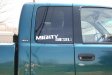
I got asked to do a decal for a company called KT Performance, diesel performance site. Their original decal was Arial.. just basic KT Performance.net.
I wanted to improve it somewhat. Tell me what you think, what I could improve on.. change.. etc.
I'm just trying to better myself.. and I know it probably sucks! But we all start somewhere.
- Caleb
I've been trying to hone my skills as a designer over the past little while.. I'm more of a logical.. programatic.. mechanic person.. and I'm trying to harness my creative side.
I got asked to do a decal for a company called KT Performance, diesel performance site. Their original decal was Arial.. just basic KT Performance.net.
I wanted to improve it somewhat. Tell me what you think, what I could improve on.. change.. etc.
I'm just trying to better myself.. and I know it probably sucks! But we all start somewhere.
- Caleb


")