• I want to thank all the members that have upgraded your accounts. I truly appreciate your support of the site monetarily. Supporting the site keeps this site up and running as a lot of work daily goes on behind the scenes. Click to Support Signs101 ...

Photoshop and Wide Format printing

What Image Editor Do You Mainly Use?

  • Adobe Photoshop

    Votes: 70 66.7%
  • Corel PhotoPaint

    Votes: 14 13.3%
  • Other Image Editor

    Votes: 0 0.0%
  • A Sign Making or Illustration Program

    Votes: 21 20.0%
  • None

    Votes: 0 0.0%

  • Total voters
    105

Flame

New Member
What kind of image?

For most stuff, illustration programs. Corel and Flexi. For advanced raster editing, photoshop.

95% of design work is Corel though...
 

jiarby

New Member
I use X3 Corel For vector stuff and since it merges so nicely with PhotoPaint I use that more than Photoshop. I don't do alot of pure bitmap work.

I am more comfortable using Fireworks! Since I used to do alot of web work I used Fireworks & Dreamweaver like I now use Corel Draw & Photo Paint.

I use Photoshop when I am messing with a Juicedrop!
 

Fred Weiss

Merchant Member
My purpose in posting the question is as it relates to my seamless tile collection. I am trying to figure out if we should be screening people out who express interest but do not use an image editor. My testing of the tiles in Flexi, Omega, Illustrator and CorelDRAW has shown me that manipulating them in these applications, while doable, is totally awkward by comparison to the ease one does the same thing in either Photoshop or PhotoPaint.
 

d fleming

Premium Subscriber
I use photoshop if I have to do some fixes or major changes to bitmaps. Other than that I mostly use Signlab. I do have Illy and corel at my disposal as well and use Corel more than Illy.
 

high impact

New Member
I use Flexi 90% of the time but own, Corel and Photoshop as well. I am trying to find the time to learn Photoshop due to the growth of the printing side of the business and the lack of bitmap editing options in Flexi.
 

ChiknNutz

New Member
Fred, do any of them use Layer Styles? If so, they won't render properly in PhotoPaint. You may already know that, but just wanted to point that out.
 

3dsignco

New Member
Photoshop for Imaging,
SignLab for everything Else Design wise and Ripping.

Fred for your tiles I would just do them all in the Big 2. PSD and Tiff and as now that most program will read PSD I would even think about dropping .tiff and just use PDS. I dont know if you use layers or not but that is one thing that I completly love about Juice drops is all the layers. With over 40 sets of JDs we have we litterally have millions of design combos at out fingertips. And also by looking at the
styles applied I have learned alot about some of the finer points of PS.

My real only complaint about JD would be that they are not tilable.
 

Fred Weiss

Merchant Member
Fred, do any of them use Layer Styles? If so, they won't render properly in PhotoPaint. You may already know that, but just wanted to point that out.

When creating tiles, what we do in Photoshop as part of the process, often involves layers but rarely involves any special effects in layer styles. Regardless, when done, we flatten all images that are put up for licensing, so this is not an issue.

What is an issue is the ability of Photoshop and PhotoPaint to precisely snap to a grid with single pixel accuracy and to see the visible result. The same is not true with CorelDRAW, Illustrator, Flexi or Omega. While they can be tiled successfully in these applications, it must be done with greater care.
 

ChiknNutz

New Member
Funny you should mention Juice Drops. I contacted them some time ago and tried to tell them to get on the 'bandwagon' of vehicle graphic fills and the like. I know that I sent them a ton of business from the posts I made (both my own personal collection as well as all the folks from here), but never did hear anything from them...guess they've got better things to do.
 

Fred Weiss

Merchant Member
Funny you should mention Juice Drops. I contacted them some time ago and tried to tell them to get on the 'bandwagon' of vehicle graphic fills and the like. I know that I sent them a ton of business from the posts I made (both my own personal collection as well as all the folks from here), but never did hear anything from them...guess they've got better things to do.

You can never forget the relative size of the markets folks like Digital Juice are serving. Sign makers and wide format printers represent a miniscule portion of the market.
 

Fred Weiss

Merchant Member
Photoshop for Imaging,
SignLab for everything Else Design wise and Ripping.

Fred for your tiles I would just do them all in the Big 2. PSD and Tiff and as now that most program will read PSD I would even think about dropping .tiff and just use PDS. I dont know if you use layers or not but that is one thing that I completly love about Juice drops is all the layers. With over 40 sets of JDs we have we litterally have millions of design combos at out fingertips. And also by looking at the
styles applied I have learned alot about some of the finer points of PS.

My real only complaint about JD would be that they are not tilable.
I can see where your perspective and mine are quite different. The average tile I distribute is around 5 MB in size when saved as a first generation quality 12 JPG. The same file as a PSD is 75 to 80 MB ... even if flattened. This would limit me to 50 or less files on a standard DVD and rule out online sales of my images. Even TIF files are two to three times the file size.

JPG gets a bad rap just because there are so many improperly made or handled files out there. The other side of the coin is that virtually every stock photography site out there thinks JPG is just fine as do their customers.

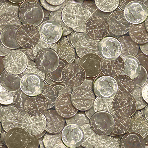
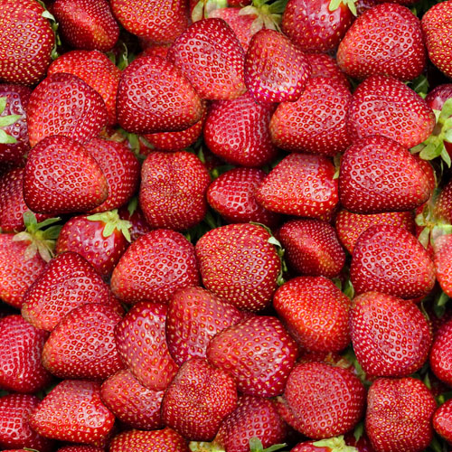
The issue of looking for seamless tiles to be possible with the kinds of imagery in the Juice Drops series is an exercise in wishful thinking. The kinds of images that lend themselves to seamless tiles are those with lots of similar objects. As soon as an images gets to be distinctive, is when making it into a seamless tile becomes a bad idea. The reason, of course, is that anything unique or distinctive becomes obviously repetitive when it is tiled.

Here is the kind of images that support seamless tiling. These are from our soon to be released Volume Two:

dimes_tile.jpg


strawberries01lr.jpg
 

blackicefx

New Member
Fred,

IMHO (H standing for humble) the strawberry tile looks too flat, unrealistic. There isn't enough depth on the edges of most of the strawberries to lend to the illusion of multiple layers of strawberries. The have the appearance of carefully outlined selections in Photoshop placed over each other. Perhaps adding slight burning to the edges would give them a more 3D appearance? Assuming that the light source is directly infront of the strawberries, shadowing/shading would be evident on all edges of the strawberries.

Take this suggestion as you will (my photoshop skills are average if that).

Matthew
BlackIceFX
 
Top