-
I want to thank all the members that have upgraded your accounts. I truly appreciate your support of the site monetarily. Supporting the site keeps this site up and running as a lot of work daily goes on behind the scenes. Click to Support Signs101 ...
You are using an out of date browser. It may not display this or other websites correctly.
You should upgrade or use an alternative browser.
You should upgrade or use an alternative browser.
Quick design
- Thread starter Hog Wild graphics
- Start date
Carl Crabtree
New Member
Looks good. Easy to read!
John Butto
New Member
Excellent work, cannot see a thing I would change.
John Butto
New Member
timeforglasses
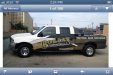
You need to get rid of that old Motorola Razr phone.From my phone I cant read a single thing on the bed sides and yes the llc should be shrunk or better yet gone
John Butto
New Member
post#4
He said he did the design for a customer, he feels good about it. I thought it look fine and nice, like I said. You never tell people their wife, baby or signs are ugly, it is not good for business.Really? Thats what you have to say? Poor contrast in my opinion.
Pixels Are Bad Mmmkay?
New Member
I think it's a decent concept but you could definitely do a lot more with it. The things I would try tweaking is something to lessen the negative space between the logo and web address. There's not much going on there. The condensed copy along the bed is a bit hard to read. Maybe use a less condensed font and try breaking it into two lines of copy. Aside from that, I would lose the Arial altogether, if not at least on the logo. Maybe try a font like Bemio for "CONTRACTING LLC".
I think for good contrast you should keep the logo level instead of rotated. It might be better, in my opinion, to have the anti flow element (the logo) in contrast with the flow element (the background). Color-wise, the logo contrasts well enough in itself, but I would try a different color scheme that puts more emphasis on the logo making it pop off the truck.
You have a great start. It could make a really nice wrap.
phototec
New Member
I have to agree, the condensed text on the bed is hard to read, so that is NOT going to help your client. Can't read the web info (sequent test).
It's our job to take their money, yet we need to give the customer something that will make them money, and to do that the wrap needs to bring business to them.
How: The information on the wrap needs to be clear and legible so their potential customer knows what they do, and how to contact them, phone number and web info needs to be clear and readable. IMO