-
I want to thank all the members that have upgraded your accounts. I truly appreciate your support of the site monetarily. Supporting the site keeps this site up and running as a lot of work daily goes on behind the scenes. Click to Support Signs101 ...
You are using an out of date browser. It may not display this or other websites correctly.
You should upgrade or use an alternative browser.
You should upgrade or use an alternative browser.
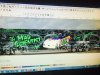
Race Trailer Wrap. Give me your thoughts
- Thread starter JandPVinyl
- Start date
Pat Whatley
New Member
Whatever that white swirly stuff is in the background it's way too busy. Knock it back to about 50% opacity as a start.
Ditto to what Pat offered.
What exactly do complex mathematical equations and geometric shapes have to do with funny car racing?
The car rendering as well as all the text is amateurish. I'd rather see a good quality photo of the car, then a poorly illustrated one. There doesn't appear to be any prioritization and it all just melds together.
JandPVinyl
New Member
His nickname is the mad scientist so the geometrical shapes and equations have to go with the mad scientist name. the focal point should be the car! And his name and photo which I will add to the back. Again this is my first one and I appreciate all the info I will work on it some more and provide updates.
Sign Works
New Member
Are you attempting to induce an epileptic seizure?
JandPVinyl
New Member
Sign Works, not really just putting a design together that the customer had wanted! I will take all constructive criticism as I am new to this and have a huge learning curve. But snide remarks are not needed!
BIG EASY DOES IT
New Member
Ditto to what Pat offered.
What exactly do complex mathematical equations and geometric shapes have to do with funny car racing?
I think this has more to do with his name but I like it but think it needs to be more of a shadow in the background it's too white, more gray
Sign Works, not really just putting a design together that the customer had wanted! I will take all constructive criticism as I am new to this and have a huge learning curve. But snide remarks are not needed!
It is hard to be constructive when the design is so... in need of a restart.
Snide remarks are actually constructive criticism. You are falling into the same old defensive mode that will not end well around here. These guys are giving you the benefit of their experience and talent for free. Try not to **** them off.
How do I nicely say it is not a professional design?
What most people do in your shoes now is start to defend the work, and get offended, and you are left with the same bad piece.
JandPVinyl
New Member
Like I said I have a huge learning curve so thanks for the insight. Not once did I defend my work other than by saying this is the ideas the customer had so now I just need to adjust it. So again THANKS all that have responded.
Like I said I have a huge learning curve so thanks for the insight. Not once did I defend my work other than by saying this is the ideas the customer had so now I just need to adjust it. So again THANKS all that have responded.
The idea isn't necessarily bad, but the execution is not great. Don't give up on the idea, just bring it up a few notches. Try the ideas that you were offered earlier, and you may get some more input.
Good luck!
JandPVinyl
New Member
Yes I definitely need to bring the opacity down, which I didn't notice until someone brought that up. I can't do much with the mad scientist lettering because it matches the car. I am in process of getting a better image of the car, and I am going to make the car larger on the side to make it the focal point. Again thanks for the input

Typestries
New Member
Good start and good on you for taking risks and doing this job and more importantly asking advice to improve your end product. You, your shop, your client and the entire industry will benefit.
Enlarge the car. Have it bleed off the top and bottom. Remove or tone down the background to 50% opacity or less. Enlarge the web site Get rid of the helvetica top left. Show us a revi.
Enlarge the car. Have it bleed off the top and bottom. Remove or tone down the background to 50% opacity or less. Enlarge the web site Get rid of the helvetica top left. Show us a revi.
Speedsterbeast
New Member
I agree with most of the advice here. But I also like the idea. The car needs to be separated from the background more. Maybe even a boring done-to-death tear in the sheet metal around the car would look ok. Car guys eat that stuff up. That and diamond plate
JandPVinyl
New Member
First thanks for all the input. so I have managed to bring the opacity down and take the Helvetica font off of the top left and I have made corrections to sizing. but I am having a real problem with this image. my customer has not got me a better photo yet so I am still working with the one that I have. again I am new to the print side so I am having trouble fading this image or bleeding the top and bottom off to make a smooth transition. also the car coming through a cut out or a peel back effect would be nice. I am using photoshop cc and flexi 8.1 pro. how would I go about the fade or about the peel back. again thanks for the input, again I am new and just trying to learn. Thanks and much appreciated.
JMPrinting
New Member
Yea, get rid of the swirly stuff, separate the car more from the design. Don't always listen to what the customer wants, go with what they want and tweak it. You are the designer, you have to wrap it...not them. Your job is to make it effective.
Pat Whatley
New Member
Sign Works, not really just putting a design together that the customer had wanted! I will take all constructive criticism as I am new to this and have a huge learning curve. But snide remarks are not needed!
Lighten up. If you can't find the actual intelligent suggestion in the snide remarks around here you are doing it wrong.
keep working with the design. You've got your basic elements together, you just need to work on the focus and flow of it. You say you haven't gotten the picture from them yet? Trying to design the wrap not knowing what the picture is going to be is kind of pointless. Because the trailer is so long getting a picture that is more of a profile will help. Something like this one off their facebook page. Also, don't be afraid to ignore the boundaries of the trailer edge....it doesn't all have to fit completely.
Attachments

Rick
Certified Enneadecagon Designer
I have a few thoughts...
Your concept and thinking conceptually is a good thing.
The logo and car are not all that nice. The colors are not all that desirable. So right off the bat, you don't have a good foundation for laying this out... at best you are turd polishing. I tried my hand at laying something out and asked my muggle son (non-designer) what he thought, right off the bat he said replace the logo and car and it would look cool. (see images below)
What I tried to do was incorporate the colors from the car into the layout. Making the whole "brand" consistent... even if it's not all the pretty.
I've looked at your cut-vinyl work. You really need to spend the time looking at good work. Then try emulating it. Stop stretching, squeezing and pulling type, especially when one side of the sign is stretched differently than the other side. Lay off the cute display type unless you absolutely have to.
Most newbies not only have to learn how to design, they have to develop taste.
Now this is NOT a reflection on you or your work but it's been stewing in my head for a long time.
I went on a rant a while back:
http://www.signs101.com/forums/showthread.php?124229-Shop-logo-attempt&p=1236289#post1236289
I highly recommend you subscribing to Signcraft and www.lynda.com
Don't learn the software... learn how to design and how the process works.
Post even your simple work here and many will help... I admire the guts it
took showing this.