-
I want to thank all the members that have upgraded your accounts. I truly appreciate your support of the site monetarily. Supporting the site keeps this site up and running as a lot of work daily goes on behind the scenes. Click to Support Signs101 ...
You are using an out of date browser. It may not display this or other websites correctly.
You should upgrade or use an alternative browser.
You should upgrade or use an alternative browser.
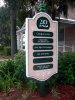
Recent simple free standing sign
- Thread starter SignManiac
- Start date
Letterbox Mike
New Member
Very nice!
SignManiac
New Member
Signage, yes each panel is attached with brass screws so they can be replaced with new one's if the tenant changes.
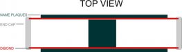
Gp, that's exactly what I did. The faces are 1/8" thick dibond sandwiched to the 4"x4" post. I slotted the inside edge of the side panels so that a 1/4" of each face is glued into it, and then gave the outer edge a slight round over. It makes the sign look like its a 5" thick solid sign. Plus it adds strength to the sign overall.
Here, went back and made a simple example from the top view looking straight down.
Attachments

SignManiac
New Member
Marlene it is. I color matched the background of the sign to the buildings siding and trim colors. It's a professional office complex in an older style home that had been renovated.
Marlene
New Member
Marlene it is. I color matched the background of the sign to the buildings siding and trim colors. It's a professional office complex in an older style home that had been renovated.
that is such a pretty color combo!
SignManiac
New Member
that is such a pretty color combo!
Thank you Marlene. I never design any sign without first considering the building color or surroundings. It's very important to visually tie all the elements together. You won't often see me making a plain white sign. 90% of all my signs use color, especially darker colors for backgrounds. Dark expands light and really improves contrast and visibility on signs.
Great looking sign, thanks for sharing! I don't have much experience with constructing larger signs like this, so this may be a dumb question. Is there any top and bottom piece at all? From your 'top view' attachment, it doesn't look like it.
Nothing on top or bottom. Bottom is too low to see and top is too tall to see. If it would have been visible, then I would have closed it in.
Just Another Sign Guy
New Member
what i like about it the most. is that i know like all of your projects you were handsomely paid to build it. if more people in our trade would listen to you they would make a lot more money than many of them do.
SignManiac
New Member
Dan, sad to say, but if I haven't been able to show others after all these years the way to sell your work for what it's really worth, I doubt I'll ever be able to convince anyone now or ever. I've preached this topic so many times that I'm blue in the face. You either get it, or you don't. Lucky for me, I do "get it".
You can't get what you don't ask for, simple as that.
You can't get what you don't ask for, simple as that.

Just Another Sign Guy
New Member
believe me i preach the same philosophy. if people want to work for free i can think of much more enjoyable things to do with your time. just my opinion, i am thankful in that i enjoy the work that i do but if i am working for free i am going to work in my garden or chase my child around the park
SignManiac
New Member
Can't really argue with that logic now can you? ") Nothing wrong with working hard, but make it a point to "play even harder"
Nothing wrong with working hard, but make it a point to "play even harder"
Nothing wrong with working hard, but make it a point to "play even harder"