-
I want to thank all the members that have upgraded your accounts. I truly appreciate your support of the site monetarily. Supporting the site keeps this site up and running as a lot of work daily goes on behind the scenes. Click to Support Signs101 ...
You are using an out of date browser. It may not display this or other websites correctly.
You should upgrade or use an alternative browser.
You should upgrade or use an alternative browser.
Retro Sign Design
- Thread starter Pinfinity
- Start date
shoresigns
New Member
Craig Sjoquist
New Member
Looks fine to me & looks very retro, good going
SignManiac
New Member
You're getting pretty good at this stuff Pin 
SheelahB
New Member
 for that ^ LOL! When in doubt, use Lobster...
Oh, and... nice design, I like the colors!
John Butto
New Member

bob
It's better to have two hands than one glove.
It's every bit as ugly as all the rest of the accoutrements of the 1950's were. During that time the cars, the houses, the clothing, the haircuts, the signs, and most everything else, were butt ugly.
Why anyone would want to revisit the hideous esthetics of that time boggles the mind.
Why anyone would want to revisit the hideous esthetics of that time boggles the mind.
John Butto
New Member
Your Momma...
Bob, you calling my mother butt ugly, John Wayne would lay you out flat with those words.It's every bit as ugly as all the rest of the accoutrements of the 1950's were. During that time the cars, the houses, the clothing, the haircuts, the signs, and most everything else, were butt ugly.
Why anyone would want to revisit the hideous esthetics of that time boggles the mind.
OldPaint
New Member
LOOKIN FOR RETRO........here ya go......
take some from one and then some from another......
https://www.google.com/search?q=old...=1854&bih=864#q=old drug STORE signs&tbm=isch
take some from one and then some from another......
https://www.google.com/search?q=old...=1854&bih=864#q=old drug STORE signs&tbm=isch
shoresigns
New Member
I remember a time when people here would pounce on a design and pick it apart with constructive criticism. Arguments would ensue, feelings would get hurt, but there was always a lot of learning. I would rather teach and learn than just give a pat on the back and a "good job!"
Here are some issues I thought would be obvious enough that they'd be mentioned in the first few replies.
Here are some issues I thought would be obvious enough that they'd be mentioned in the first few replies.
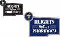
- Whether a font is attractive and whether it's appropriate for a particular use is mostly subjective, and subject to change with changing trends. Lobster was a great font until it became ubiquitous, which makes it a poor choice for almost any type of layout now. It looks like you picked the first font that came up when you searched for "retro font". Its popularity also makes it really obvious that you're not using an authentic typeface from the era.
- Black drop shadow on dark blue background. It's hard to see (poor contrast) and drop shadows are not particularly prevalent in the style you're attempting to reproduce.
- The shape of the sign. You haven't done anything to make your layout complement the outer shape (sometimes known as the "format") of the sign. You have a big awkward bit of whitespace in the bottom left, and assuming the sign is double-sided, you'll have to come up with something that works on both sides.
- Keep your audience in mind. This might be a matter of opinion, but to me, the Rx symbol is something that the public would recognise, while the snake sipping from a martini glass is something pharmacists and doctors would be familiar with.
- If you're refinishing an old sign, why don't you show us a "before" picture for context?