• I want to thank all the members that have upgraded your accounts. I truly appreciate your support of the site monetarily. Supporting the site keeps this site up and running as a lot of work daily goes on behind the scenes. Click to Support Signs101 ...

Revamp time....

Circleville Signs

New Member
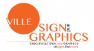
Well, some of you may remember a couple of years ago we re-vamped our logo. It was, if I do say so myself, not a good process.

It's one thing to design a logo for a client. You aren't close to it, and you can be objective. Not so much when doing your own.

In any event, I'm working on what i hope will end up being a "final" revamp, if you will, going in an entirely new direction. I want the emphasis to be on "SIGN" and "GRAPHICS". Our currently logo the emphasis is on "Circleville".

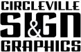
here's what I've got so far. I know it isn't great. Any feedback would be appreciated, as I'm just stuck on it.
 

Attachments

  • 2012-Logo-V1.png
    2012-Logo-V1.png
    35.8 KB · Views: 124

Fanaticus

New Member
I don't like the color of the circle. I keep thinking make it blue. Then you'd have to change the color of "circleville". Just my quick thoughts.
 

Craig Sjoquist

New Member
I like the design / layout simple and effective.
My questions would be ... white / yellow / orange on yellow / orange on white... even though signs is big

Also the script is nice but some what hard to read being white on yellow / white with a thin outline of black.

Just think you need to re look at what your doing , start out with black and white design / layout before you add color and effects.
 

HulkSmash

New Member
It needs some work Brotha! The colors remind me of like a sunset, and then orange juice.. mmm i want some orange juice....
anyways um you can do better. Or hire it out! Branding is one of the most important
aspects of ones business. Make sure it's the best
 

Circleville Signs

New Member
ROFL!!!

Consensus is.....

it sucks (I kind of already knew this)...

Gonna take a few more cracks and see what I can come up with...And if it's still a big "ick" I'll hire it out. Creative juices have been a bit stymied lately - may need to a recharge...Vacation is coming up though...
 

Circleville Signs

New Member
Yup. Orange is kind of a must. It's the one thing I'd like to carry over from our current logo. That's also where the dot in the "i" came from (our current logo). This is what we have currently, just for reference...
 

Attachments

  • CSG-Logo-2010_V4.jpg
    CSG-Logo-2010_V4.jpg
    16.2 KB · Views: 85

Circleville Signs

New Member
OK - whole new direction. Stayed black and white for now, although there will be some orange thrown in if this makes the "final" cut.

I feel like this one has a much more cohesive feel to it, and stands better on it's own than the earlier (i.e., crappier) one did.

Thoughts?
 

Attachments

  • 2012-Logo-V2.png
    2012-Logo-V2.png
    7.4 KB · Views: 117

SignManiac

New Member
Gary I feel your pain. Just yesterday I was thinking that I really should have a logo myself. All I'm using now is pretty much my avatar one. I started to think about what direction I should go but given my name, I have absolutely no idea where to start.

I mean really, what the hell does Skywatch have to do with signs? nothing at all. I've even gotten to the point I don't like to use signs in the name as I don't want to be pigeon holed into that alone. I usually just answer the phone Skywatch anyway.

My other dilemma is I have no sign at all on the building or road, nor do I want one. So do I even need a logo at all? I'm really confused and suffering from an identity complex. I can't change the name now, I've used it for twenty years and everyone pretty much knows who I am.

I'm looking forward to seeing what you end up with. I'm sure with the help and suggestions you get here, it will end up awesome in the end.

Good luck with the change!
 

RobbyMac

New Member
Maybe try incorporating a negative & like so? Just a basic idea...
I tried condensed bold at first, but it seemed a bit heavy/competed with SIGN
 

Attachments

  • Graphic1.jpg
    Graphic1.jpg
    31 KB · Views: 96

rickzan

New Member
I like your circle logo. change circle color and use ampersand instead of 'and' also use dot on 'i' and say signs instead of sign. Don't let folks bum you out!:doh:
 

Marlene

New Member
I really like the direction 2niner went in. I think you would need to have the whole word circleville as most people aren't bright enought to get the circle as part of the name. love the way 2niner used the "and". in all your versions, it always looked forced and cluttered but used like 2niner, it becomes a visual element that looks really nice and professional.
 

2NinerNiner2

New Member
Thanks, Marlene :)

Yeah, that's what I thought about using the whole word too as I probably wouldn't "get it" either unless I had had my first three cups of coffee! :)
 
Top