T
-
I want to thank all the members that have upgraded your accounts. I truly appreciate your support of the site monetarily. Supporting the site keeps this site up and running as a lot of work daily goes on behind the scenes. Click to Support Signs101 ...
You are using an out of date browser. It may not display this or other websites correctly.
You should upgrade or use an alternative browser.
You should upgrade or use an alternative browser.

SignManiac
New Member
I can't read it............................easily. You're trying to be far to clever. Keep It Simple.....
2B
Active Member
I can't read it............................easily. You're trying to be far to clever. Keep It Simple.....
+1
trying to hard to merge design elements

Craig Sjoquist
New Member
I like the idea ... good for a small town feel ... the sign shop .. kinda like people say he the ..sign guy, or sign gal or what ever everyone knows ya by that I bet in many of towns there is ... the sign shop
Anyway 1st your eye goes to the big S then SIGNS ...then the shop ... then of Dalton, but it also wraps around the big S & signs
also under the Big S there is this gap very noticeable ... 1st I would try reducing the size of ..the & shop tuck of Dalton in that space so the big S & all copy same height
Next try a gray for ..the & shop & remove the shade on the & shop
then a gray for the big S ...what I'm getting at is play on the name ...the SIGN shop of Dalton ...
WHY ... the big S is just that a big S ...but your name ..The SIGN Shop is like saying your own name & your personal name like John Doe is like a neighbors hand shake
It is a nice clean modern look just needs tightening up
bikecomedy
New Member

I like yours. Play around with different ideas. I took a minute to see what I could do really quick... this is the result. Not great but it was fun making it.
T
TonyC
Guest
Round 2.1
I do appreciate everyone who have expressed opinions, given encouragement and/or advise to this thread. As stated before, I am not a graphic or logo designer and I don't claim to be. My company is however being forced to do more of this type work due to the changing economy. Most of the shops in this area have gone by the way side and we are about "The Last Man Standing" (so to speak.) There are only 5 of us in my shop and my wife is the only artistic one in the bunch but she stays busy shuffling paperwork. Mr. Sjoquist, I do really appreciate your information, honesty and critique. At your prompting, I have ordered 3 books on logo design and sign layout (I would rather read a good Grisham book). I am submitting version 9673 for everyone to critique. Thank You, Tony PS, How the hell do I get this thing to make paragraphs????
I do appreciate everyone who have expressed opinions, given encouragement and/or advise to this thread. As stated before, I am not a graphic or logo designer and I don't claim to be. My company is however being forced to do more of this type work due to the changing economy. Most of the shops in this area have gone by the way side and we are about "The Last Man Standing" (so to speak.) There are only 5 of us in my shop and my wife is the only artistic one in the bunch but she stays busy shuffling paperwork. Mr. Sjoquist, I do really appreciate your information, honesty and critique. At your prompting, I have ordered 3 books on logo design and sign layout (I would rather read a good Grisham book). I am submitting version 9673 for everyone to critique. Thank You, Tony PS, How the hell do I get this thing to make paragraphs????
Attachments
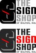
Tony, IMO the bottom one is better (with SIGN in RED) ... it grabs your attention more than the one above (with Gray & Black text). My only suggestion would be to maybe add a thin White stroke around the Black "S" icon to help pull it out of the Black background a bit, leave the Gray and Red shadow effects as is, just see what it looks like with a thin White stroke around the "S".
2B
Active Member
Tony, IMO the bottom one is better (with SIGN in RED) ... it grabs your attention more than the one above (with Gray & Black text). My only suggestion would be to maybe add a thin White stroke around the Black "S" icon to help pull it out of the Black background a bit, leave the Gray and Red shadow effects as is, just see what it looks like with a thin White stroke around the "S".
+1