• I want to thank all the members that have upgraded your accounts. I truly appreciate your support of the site monetarily. Supporting the site keeps this site up and running as a lot of work daily goes on behind the scenes. Click to Support Signs101 ...

Shuttle Bus Wrap Opinions

smdgrfx

New Member
I need some help!!!

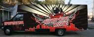
Just finished doing the attached layout. I'm stuck with ideas. Please give me some feedback. Please be honest. The bus is for a missionary that does an event every Tuesday evening for inner city kids. He will be picking up and dropping off kids "in da hood". So, we tried to tailor the design to be popular with the youth so that maybe they will come out just so they can ride in the hip hop shuttle. We will be covering the windows completely in case you are wondering. No window perf. Not in the budget. :design:


Automated message:

Please observe Signs 101 rules on posting pictures found here
www.signs101.com/forums/showthread.php?t=35000
:thankyou:
 

Attachments

  • hip.jpg
    hip.jpg
    54.5 KB · Views: 63
Last edited by a moderator:

HulkSmash

New Member
You designed it... or stacked 5 layers of stock vector on top of one another? I'm sure you can be more creative.
 

smdgrfx

New Member
You got it!! Almost...The customer came in to the shop, sat on one of my computers and pointed to images he liked on istock. Why would I draw up/redesign a wing and DJ when it is already done and I can pay for it??? Plus, that is what he wants. Don't come on here bashing without giving any ideas on what could be different.


If you have something productive to say, then say it. If not, stay off the thread please.
 
Last edited:

MikePro

New Member
stagger the "hip hop hope". i find it hard to read.

don't have any suggestions for the flare behind the dj, but i know i don't like it... color maybe? my eyes are drawn to it, and not the rest of the graphic.
 

smdgrfx

New Member
We are considering taking the flare off. I did it in different colors and it looked even more overbearing. Without it, there seems to be too much empty/negative space. I'm going to think about it over the weekend and offer suggestions on Tuesday. That's why I came to the boards to see if I could get some feedback from people that haven't been looking at this for a week. We've made many changes. The customer changed his mind probably 20 times over the week. The "hip hop hope" is his current logo, but not opposed to changing it up.
 

Des6139

New Member
If thats what he wants,Thats what he wants, Two suggestions, Try lime green instead of red and brake up the HIP HOP HOPE :popcorn:
 

Artildawn

New Member
the color scheme seems to belong to the "other team" rather than the one the mission represents. You should be able to do urban without going to a dark place. I like the gold instead of red suggestion but then you'll probably want to change the gradient in the rays too. Maybe sunset colors yellows to orange to red.

I recommend making "Hip Hop Hope" it's own line using the distressed font you have. You can add the hiphophope.com smaller in a more standard legible font. Think of it as logotype with a URL added below.
 
Top