-
I want to thank all the members that have upgraded your accounts. I truly appreciate your support of the site monetarily. Supporting the site keeps this site up and running as a lot of work daily goes on behind the scenes. Click to Support Signs101 ...
You are using an out of date browser. It may not display this or other websites correctly.
You should upgrade or use an alternative browser.
You should upgrade or use an alternative browser.
Sign I just did!
- Thread starter Signmaker1234
- Start date

ExecuPrintGS
New Member
Looks great. You really made the MDO look nice. 
my only wish is that the mounting hardware was painted white so it didn't stick out so much.
my only wish is that the mounting hardware was painted white so it didn't stick out so much.
J Hill Designs
New Member
+1 paint the hardware (its the little things)
speaking of little, dat address...
speaking of little, dat address...
Signmaker1234
New Member
Thanks!
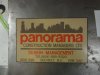
Never thought about painting the hardware, it is stainless so it won't rust, maybe next time I will paint! The address looks small but the sign is 6' long and it is definitely readable.
Never thought about painting the hardware, it is stainless so it won't rust, maybe next time I will paint! The address looks small but the sign is 6' long and it is definitely readable.
signguy 55
New Member
No offense to you or implied. I realize this was probably a "logo" you reproduced faithfully, but if this was done B.C. (before computers) no customer that I ever had would pay for that. When signs were hand painted everyone demanded perfection and wouldn't settle for less. "Why does the o and the s go 1/16" above and below the baseline?" My how things have changed!
J Hill Designs
New Member
No offense to you or implied. I realize this was probably a "logo" you reproduced faithfully, but if this was done B.C. (before computers) no customer that I ever had would pay for that. When signs were hand painted everyone demanded perfection and wouldn't settle for less. "Why does the o and the s go 1/16" above and below the baseline?" My how things have changed!
this is an odd comment. O, S, C, etc are SUPPOSED to go above and below the baseline...
why would someone not pay to have their sign painted?
I just dont get it

Gino
Premium Subscriber
this is an odd comment. O, S, C, etc are SUPPOSED to go above and below the baseline...
why would someone not pay to have their sign painted?
I just dont get it
Haha..... I think someone started Friday Happy Hour early. I'd like to know where does the 1/16" come into play.
He's right about one thing, though. When we had to hand letter.... everything had to be perfect and executed just right. Now that we have the equipment to perfect this, now they all want things looking like they were drawn with crayons and kids with sh!t all over the place.

shoresigns
New Member
I die a little inside whenever I get artwork this bad from a customer.
Bigcat_hunter
New Member
What is a seed ball?
sardocs
New Member
I kinda know how you feel Shoresigns. Why did we work so hard to learn to handletter like a machine if the clients are going to force us to put on decals that look like this example (pic of Cobalt). I had to put that on a brand new $1.5 million dollar yacht. Barf... I don't really miss doing 4 sets of magnetics by hand now that I don't have to anymore, but the number of horrid amateur typestyles available is depressing.
Attachments

OldPaint
New Member
the only thing that jumps out at me....is the "negative" space is more then the "sign" space and you may as well woulda been better not to put the address down there.
as an "old sign painter" this is one of those jobs that needed to...STRETCH the words a little(not to the point of distortion)......to fill some more of the NEGATIVE SPACE. of which there is way to much.
as for the attaching points NOT BEING painted...........makes it look like it was slap up project.
GAC05
Quit buggin' me
From their webpage "seed-balls.com"What is a seed ball?
Some kind of eco-guerrilla, Johnny Appleseed type weapon......
wayne k
guam usa
Signmaker1234
New Member
Thanks for the feedback!
I was fairly compensated, the customer loves it and I think it turned out great! As far as the layout, that's their logo and in no way was I stretching it! The address is supposed to be smaller since it is not the focal point, it is def readable from the road. Next time I will paint the hardware, I don't think it makes a crappy install even though I didn't , they are stainless so the won't rust! But I agree it prob would look better with them painted! If I didn't route the edges or fill the voids, that would be a crappy job! Thanks for the feedback, I learned something new! As far as seed-balls, it's a way of gardening that has been around for a while and they are also tossed into vacant lots in the bigger cities to grow flowers and beatify the area! They also make milkweed Seedballs that are thrown in the areas that the monarch butterflies travel to help them out since it is the only plant they eat! It is a pretty cool product and company! Thanks again!
If he was fairly compensated for his time and the client is happy with it, despite some minor issues with design and finishing, then the sign was a success for the parties involved. The critiques above were excellent. That cobalt thing though...
I was fairly compensated, the customer loves it and I think it turned out great! As far as the layout, that's their logo and in no way was I stretching it! The address is supposed to be smaller since it is not the focal point, it is def readable from the road. Next time I will paint the hardware, I don't think it makes a crappy install even though I didn't , they are stainless so the won't rust! But I agree it prob would look better with them painted! If I didn't route the edges or fill the voids, that would be a crappy job! Thanks for the feedback, I learned something new! As far as seed-balls, it's a way of gardening that has been around for a while and they are also tossed into vacant lots in the bigger cities to grow flowers and beatify the area! They also make milkweed Seedballs that are thrown in the areas that the monarch butterflies travel to help them out since it is the only plant they eat! It is a pretty cool product and company! Thanks again!
OldPaint
New Member
you spent the time to route the edge, and fill the voids......painting the hardware.....2 minutes???? priorities... i guess.
as for not "fitting text to sign" increasing the hight of the letters, even though it is a logo of sorts....IF YOU did it in proportion to length .........it would not look any different. a boarder woulda help take up some of the negative space....
as for not "fitting text to sign" increasing the hight of the letters, even though it is a logo of sorts....IF YOU did it in proportion to length .........it would not look any different. a boarder woulda help take up some of the negative space....
signguy 55
New Member
The baseline quote was actually said to me back in the '90s when I was lettering a billboard. I had tape on the straight letters and had pulled off the tape to do an "O" and and "S" rounded top and bottom. Customer couldn't figure out what I was doing and acted like I was an idiot. Explaining that and which direction an arrow points on a double sided sign were two of my more intense conversations I've ever had in my 26 years in the signs business!!!!!this is an odd comment. O, S, C, etc are SUPPOSED to go above and below the baseline...
why would someone not pay to have their sign painted?
I just dont get it