• I want to thank all the members that have upgraded your accounts. I truly appreciate your support of the site monetarily. Supporting the site keeps this site up and running as a lot of work daily goes on behind the scenes. Click to Support Signs101 ...

Simple before and after

SignManiac

New Member
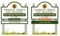
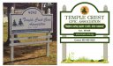
A previous client of mine contacted me about replacing their home owners association sign with a new one. I asked if I could make a few design tweaks to the one they sent me a photo of. I was told no problem, have at it.

Here's the new design while keeping it close to their original. They supplied me with what they said is their new logo. It appears to be an orange sliced in half with a pine or spruce tree on top? I also think there's too much copy on this sign but oh well, what are you gonna do... At least you can try and improve an ugly design.
 

Attachments

  • Temple.jpg
    Temple.jpg
    66.3 KB · Views: 111

Gino

Premium Subscriber
If you don't mind..... I was looking at something which I found a little odd. What font is the 'Temple Crest' main copy ??

I just noticed the 'L' and 'E' base lines don't match. It's different and I just wondered a bit.
 

Gino

Premium Subscriber
:thankyou:.... I really like when things are different. That's different.

I would never have made a good dentist, cause I'm not into symmetry.
 

Marlene

New Member
By luck, so far they haven't caught that deliberate omission on my part :)

if they do need it for 911, just put the numbers on the post or a small hanging sign. I hate having to put those on a sign. I think if the building is visable from the road they can put the number on that.
 

nwsigns

New Member
Nice, my only suggestion would be to reverse out the phone number panel and make it white text on green, I dont like the border being bigger than the text. Sure beats the old phone number though.
 

cha88

New Member
the only thing that i would change personally is make the text in both green panels the same font... JMO
 

SignManiac

New Member
Nice, my only suggestion would be to reverse out the phone number panel and make it white text on green, I dont like the border being bigger than the text. Sure beats the old phone number though.


Brian good eye! I like that idea and can now see it since you pointed it out. Here it is with the reverse color.
 

Attachments

  • Temple Crests.jpg
    Temple Crests.jpg
    60.6 KB · Views: 83

Gino

Premium Subscriber
What would happen if you put the phone in where the website is and brought the website down ??

Personally, I don't like phone numbers on main signs, but if you have to, ya hafta.
 
Top