• I want to thank all the members that have upgraded your accounts. I truly appreciate your support of the site monetarily. Supporting the site keeps this site up and running as a lot of work daily goes on behind the scenes. Click to Support Signs101 ...

Simple Sign Critique - too simple?

RyanT

Director of Entropy
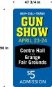
Keeping things simple on this one... what do you think? Too blocky and simple? Not the right feel for a gunshow? These will be put up along the roadside.

They will be painted background and cut vinyl text per customer request. The date and $ will be changed out on occasion, so I figured putting an off-color behind that vinyl will allow me to repaint the black area quick to get rid of any fading around old letters.

Suggestions welcome. I have thick skin.
 

Attachments

  • Straight GS sign.jpg
    Straight GS sign.jpg
    46 KB · Views: 259

Gino

Premium Subscriber
Too many shapes and color changes. While each idea is different, nothing flows when you divide each line of copy. Also, I think 'Gun Show' should be your main focal point, not the date. Get rid of that casual script. Last thing, your copy goes too close to the edges.
 

RyanT

Director of Entropy
Thank you, I couldn't put my finger on what was bothering me about the fonts, but that's the word - too casual. On the hunt for better script now.

And good call on the fairgrounds thing - apparently it's one word anyway
 

Johnny Best

Active Member
AS they say about changing the casual font , being close to the edge, and one word thing, I like it, the blue and the black work. Since people will be driving by, it will attract attention.
 

signbrad

New Member
I'm not sure a design can be too simple. Simplicity can still have eye appeal. I have made this design simpler than it already is by reducing the number of background panels.

Also, whenever I approach a job like this, the first thing I do is prioritize the information. The idea is to create a clear visual hierarchy of the elements in the composition.
I designate one element as dominant and I make sure that no other elements compete with it for attention. It's what you want the viewer to see first. It is the "entry point" to the design. Dominance can be easily achieved with size, stroke weight, color, etc.

Is this a vertical 4x8? It looks like it. Which tells me it may not be a residential city street sign, but a sign on a road with faster traffic. The time spent looking at a sign like this may only be 1 to 1½ seconds unless there is a convenient stoplight. So a viewer may only be able to read and digest one, two or three words at most.
We control which words these are by making them dominant. Everything else should be subordinated. Think in terms of foreground, middle ground, and background, just like in a landscape painting.

I also like to group things that belong together. This is the principle of proximity, which states that elements that belong to each other should be closer to one another. Or another way to put it is that things that are closer together appear related.

A small point: sometimes, from a distance, a dollar sign can be mistaken for another number. I'm in the habit of downsizing them for this reason.

.................

There are probably only a million ways this sign could be layed out. :smile:


gun show02.jpg
 

Attachments

  • gun show.jpg
    gun show.jpg
    47.9 KB · Views: 184

Billct2

Active Member
I like what Brad did, though I think where and when are equally important and the date gets a little lost.
I also totally agree about the $ sign, I always downsize it.
 

signbrad

New Member
I think where and when are equally important and the date gets a little lost

Yes. This can be done differently. Good point. The initial consultation with the client can give you clues for the order of importance. I probably would have suggested to the client to drop "BUY SELL TRADE" (every gun owner knows what happens at a gun show, right?) and then downsize or even eliminate the admission price.

Every initial consultation with a client should focus on what can be eliminated: unnecessary words, needless repetition, etc.
Think: what can you read in 1.5 seconds?

Brad
 

Johnny Best

Active Member
Since we only have 1.5 seconds to read, gunshow.jpg and agree with no buy sell trade and price. You just need what, when and where on sign.
 
Top