• I want to thank all the members that have upgraded your accounts. I truly appreciate your support of the site monetarily. Supporting the site keeps this site up and running as a lot of work daily goes on behind the scenes. Click to Support Signs101 ...

Simple Wrap Layout

tintguy31794

New Member
Hey guys/gals.

I'm interested in you guys opinion of this wrap I'm trying to do for a company truck of ours. We do so much here so its kind of hard to get absolutely everything that we do on the wrap so I thought the banner going accross would be best. Other than that its just a simple background from aurora. My main goal is to let everyone know that we do wraps. My Boss's main goal is to advertise the 300+ things that we do here :D.

Please let me know what you think.

Thanks,

Brent
 

Attachments

  • sstruck.jpg
    sstruck.jpg
    41.2 KB · Views: 117

Jillbeans

New Member
I don't like the letterstyle for the laundry list, it's not "speedy" it's more "1970s Restaurant Menu" stretched. Don't like that truck accessories is listed twice.
Don't like the "& more".
I do like the laundry list panel idea, may be hard to get it aligned correctly when wrapping.
And it is at least legible, so that's always a plus.
It just somehow seems to lack "oomph" and seems rather grandfatherly looking.
Love....Jill
edited to add a really quick and dirty suggestion.
 

Attachments

  • Graphic1.jpg
    Graphic1.jpg
    218.1 KB · Views: 89
Last edited:

tintguy31794

New Member
Thank you Jill,

I truly appreciate it!

speed shop and truck accessories has to be together (Boss's orders) because it is the company name. I do agree with you on the letter style.


Thanks again
 
Last edited:

tintguy31794

New Member
I found a gap of time.

Here it is with the banner fixed per suggestions.

The font used for the business name is pretty much on all of our signs so I would like to keep it like that, but it can be re-arranged if you guys have any suggestions or think it needs it. (font is competK or compacta black)

I liked the background that I found on aurora I just hope it prints awesomely :D

Thanks again guys.

Brent
 

Attachments

  • speedshoptruck2.jpg
    speedshoptruck2.jpg
    41.6 KB · Views: 72

Jillbeans

New Member
...the serpentine is even more dated (to me) than the belwe or whatever that first one was.
I am glad you took out the accessories and the & more though.
:)
 

jc1cell

New Member
Here's the blind (me) trying to pay back what I've received. :peace!:

The first thing that pops out when I see it is everything. Seems like there's no main focal point. The background, to me, looks too dull. It shouldn't compete with the foreground but as it is right now, don't really find it appealing.

Also, the items are falling to close to the edges of the vehicle. The top section ends on the top tail light almost. The phone number might get cut off during install, as well as truck accessories. A bit tight.

You can keep the list as is but make the copy smaller so it doesn't compete with the rest. Make Speed Shop your main focal point with Truck accessories a bit smaller and maybe a different type face.

Again. The blind trying to repay. Not much of a layout expert here, but I sure know how to get advice here :Big Laugh

Cheers,
jc
 

AUTO-FX

New Member
what if you ditched the blue banner but left the listing in a different color, and faded the background image near the top to allow the list to read?
 

tintguy31794

New Member
The background is dull because it is a bootlegged version of it atm(asked them and they said do it).. the background image is $85 lol.. didn't want to jump on it without knowing if we liked it. I hope that it prints great for that much money.

I will also put the text on the bed only and see how we like that. (after trying to align aurora truck with our vehicle outline it actually changed the game alot)

so thanks for the input and I will be back with you guys soon.
 

Jillbeans

New Member
I don't care for that font choice either, and it seems real stretched to fit.
I think by putting some sort of frame around the speed shop portion it may make it stand out more.
A "cool" background, to me, is not the most important part whether it's $85 or $8500.
But I probably think that because I'm an old-fashioned sign person, not a wrapper.
 

tintguy31794

New Member
I think today I have rediscovered that I am not a designer. I know this and I've known it for a long time. I am here making a living and I've been given a task to do. I would absolutely love to outsource all these designs because the amount of time it takes me to do this is not good.


Thanks for your input i'll be back soon.
 

Jillbeans

New Member
Hey at least you are a good sport.
And there are quite a few great freelance designers on 101.
The money spent to get a useable effective design from one of them would be well spent.
 

bigprinter

New Member
I am a little late to the party. But just a reminder, when dealing with vehicle graphics Minimum is always better then going all out. Keep it very very very simple, clean, legible. DO NOT put all your eggs in one basket. You have literally seconds to make an impression, you need to figure out 2 things. 1. do you want your "impression" to be branding. 2. do you want your "impression" to be marketable.

For option 1, you just put your logo/contact info (this helps for bigger companies where they just want their logo/name out in the public) they want as many visual impressions as possible to build their brand.

Option 2, is a little more tricky. This is where you narrow down your field and say "Who do we want to appeal too and how do we do that" You cant put that much text on the side of a wrap and expect people to remember anything that was on it. In this case, just putting big bold letters that say "WE DO TRUCK STUFF, LOTS OF IT" is better IMO then the design you have.

Option 2 is definitely the hardest one to pull off, but when done right can make a world of difference.

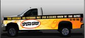
On to the design. Your phone number above the wheel well will distort (if you can even get it in that tiny little space) in fact, I would move it somewhere more legible or shrink it in size alot. Also, your logo stretched that far on the side is way to much. That is almost 6 feet of "Brand" across the side of your truck, and honestly, your not Honeywell or Motorolla, so talk your boss out of that idea because no one is gonna know what to think when all they see as you blur by is "Speed, truck...damn, what was the rest?". Even a smaller logo on the door is better imo then what you have now. This goes back to option number 2 above, make a statement, get the person interested. In design you either make a statement or ask a question. Statement = "Just do it" question = "Got milk?" see the difference? Right now you are not doing either one.

Also, you have to take into consideration the gap between the truck and the bed, it is at least 2". Normally you never want text to go from front to back like that, treat them as 2 different identities when doing the layout, it may help you a bit more.

I think you need to go back to the drawing board, insist to your boss the ideas I put above about branding, question or statement? Invigorate the people around you by making them work for it, people get bored with stale, you need originality.

I hope that helps, good luck to you!
 

Flame

New Member
Please. Start over. Fonts are boring. Nothing pops. No focal point. Ugly background (regardless of price).

Wraps can be tough cuz you just want to go all out. So, hey, sometimes it takes a few do-overs. I'd do one and see where it goes....

Fresh eyes. Take a break. Take a wack at it tomorrow.
 

onesmf

New Member
Wow! You certainly do have a lot of different areas of expertise. Obviously, most agree that attemtping to advertise so much likely takes away from your focus and advertising objective. Have you thought about advertising the truck accessorie aspect of your business on one side and the sign stuff on the other? Good luck. Make a great day for yourself.
 

tintguy31794

New Member
Thank you all for your input. I will start on this with fresh eyes tomorrow. I don't disagree with anything you guys are saying lol I wish I could...

yes I wish we just did one thing here it would make it a little easier on me, but we do so much here it is ridiculous lol.

Thanks again,

Brent
 
Top