Stacey K
I like making signs
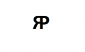
Don't laugh at this attempt, please. It's driving me insane. What the heck does a top of a tree look like? Trying to make a P from a tree trunk and the R part to look like a river. This might be beyond my skills. Is the top of the P too high? Something looks weird...or maybe the whole thing is bad?
Colors not set in stone, just getting a rough draft at this point but I'm dying here! He doesn't want leaves but wants it to look like the top of a tree. Not asking for anyone to do this for me, just perhaps some guidance. Maybe the river should be more flowy...I didn't really do anything with it. IDK...this one has me stumped and drowning...lol
Colors not set in stone, just getting a rough draft at this point but I'm dying here! He doesn't want leaves but wants it to look like the top of a tree. Not asking for anyone to do this for me, just perhaps some guidance. Maybe the river should be more flowy...I didn't really do anything with it. IDK...this one has me stumped and drowning...lol

 , but what if you started with something like this: