-
I want to thank all the members that have upgraded your accounts. I truly appreciate your support of the site monetarily. Supporting the site keeps this site up and running as a lot of work daily goes on behind the scenes. Click to Support Signs101 ...
You are using an out of date browser. It may not display this or other websites correctly.
You should upgrade or use an alternative browser.
You should upgrade or use an alternative browser.
Suggestions for DOT lettering font in short space
- Thread starter trakers
- Start date
VinylCraft
New Member
Find a new space. Theres not much eles you can do.

Fred Weiss
Merchant Member
Fred Weiss
Merchant Member
Gee, Fred... Do you think we oughta send him a Corel file?


Each of us is all the sums he has not counted: subtract us into nakedness and night again, and you shall see begin in Crete four thousand years ago the love that ended yesterday in Texas. . . . The seed of our destruction will blossom in the desert, the alexin of our cure grows by a mountain rock, and our lives are haunted by a Georgia slattern, because a London cutpurse went unhung. Each moment is the fruit of forty thousand years. The minute-winning days, like flies, buzz home to death, and every moment is a window on all time.
Thomas Wolfe, Look Homeward Angel
Fred Weiss
Merchant Member
well, that'll teach you to think again, before thinking Bogie
Or to put it another way ...
When you come to a fork in the road, take it.
Yogi Berra
Kysparky
New Member

Fred Weiss
Merchant Member
One of these days in your travels, a guy is going to come up to you and show you a nice brand-new deck of cards on which the seal is not yet broken, and this guy is going to offer to bet you that he can make the Jack of Spades jump out of the deck and squirt cider in your ear. But, son, do not bet this man, for as sure as you are standing there, you are going to end up with an earful of cider.
Damon Runyon - The Idyll of Miss Sarah Brown
:Sleeping:
Kysparky
New Member

Fred Weiss
Merchant Member
I'm not a member of any organized political party, I'm a Democrat!
Will Rogers
Will Rogers
skyhigh
New Member
Help please
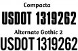
I need to fit some USDOT numbers within a 12" space
If I read the specs correctly the lettering needs to be 2" high but I can't seem to find a font that will allow me to fit text similar to the below within a 12" width when 2" high.
USDOT 1319262
USDOT #'s have to be a minimum of 1.5" high. I'm sure that will help.
Last edited:
ddubia
New Member
I use Folio Condensed for such things.
Folio seems to be a font that does not really have a personality of its own. It can be used on for a lot of things and the condensed version fits your dilema pretty well. You can kern it just a little tighter even if you need to for your purpose.
Folio seems to be a font that does not really have a personality of its own. It can be used on for a lot of things and the condensed version fits your dilema pretty well. You can kern it just a little tighter even if you need to for your purpose.