-
I want to thank all the members that have upgraded your accounts. I truly appreciate your support of the site monetarily. Supporting the site keeps this site up and running as a lot of work daily goes on behind the scenes. Click to Support Signs101 ...
You are using an out of date browser. It may not display this or other websites correctly.
You should upgrade or use an alternative browser.
You should upgrade or use an alternative browser.
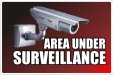
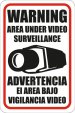
Surveillance Sign <O><O>
- Thread starter functionpdx
- Start date
RJ California
New Member
functionpdx
New Member
Craig Sjoquist
New Member
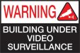
very poor layout, that's why your eyes say it's weird
use lower case more like this & smaller, plus raise it up off bottom
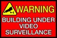
.. ..Building
..Under Video
SURVEILLANCE
get it away from edges more
read Mike Stevens Mastering Layout and you would not have to ask no offence intented
use lower case more like this & smaller, plus raise it up off bottom
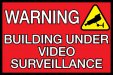
.. ..Building
..Under Video
SURVEILLANCE
get it away from edges more
read Mike Stevens Mastering Layout and you would not have to ask no offence intented
S
Sign-Man Signs
Guest
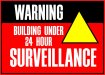
Add 24 hour to it.
SignManiac
New Member
Keep it simple and think outside the box if you have a printer or access to one.
This is a very simple sign I designed and it makes the point in as few words as possible.
Notice the intentional reversal of the name, this is to fool the would be thieves. While they stand there trying to figure out what it says the police have greater time to respond and catch the idiots.
This is a very simple sign I designed and it makes the point in as few words as possible.
Notice the intentional reversal of the name, this is to fool the would be thieves. While they stand there trying to figure out what it says the police have greater time to respond and catch the idiots.