-
I want to thank all the members that have upgraded your accounts. I truly appreciate your support of the site monetarily. Supporting the site keeps this site up and running as a lot of work daily goes on behind the scenes. Click to Support Signs101 ...
You are using an out of date browser. It may not display this or other websites correctly.
You should upgrade or use an alternative browser.
You should upgrade or use an alternative browser.
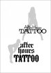
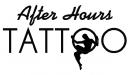
Tattoo shop logo.
- Thread starter Jillbeans
- Start date
Pixels Are Bad Mmmkay?
New Member
I really like the top one, Jill. The font works well with the look you're going for and it's easy to read. The T's could use a little tweaking but nice overall. The second one looks good but lower case blackletter is usually always hard to read.
")
thinksigns
SnowFlake
WildWestDesigns
Active Member
I really like the top one, Jill. The font works well with the look you're going for and it's easy to read. The T's could use a little tweaking but nice overall. The second one looks good but lower case blackletter is usually always hard to read.
^+1
AnotherSignManiac
New Member
My initial thought.
I really like this one, though I think the silhouette looks a bit manly lol!
thinksigns
SnowFlake

 love the fonts in top one-
btropical.com
New Member
got more tramp stamp ?
HulkSmash
New Member
The silhouette is just a rough.
I am going to hand-draw something once I know which shape he likes.
i see. nice
Craig Sjoquist
New Member
Likes them both, top one looks refreshing and contemporary, bottom looks more tattoo style.
Thinks both can be useful
Thinks both can be useful
