-
I want to thank all the members that have upgraded your accounts. I truly appreciate your support of the site monetarily. Supporting the site keeps this site up and running as a lot of work daily goes on behind the scenes. Click to Support Signs101 ...
You are using an out of date browser. It may not display this or other websites correctly.
You should upgrade or use an alternative browser.
You should upgrade or use an alternative browser.
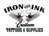
Tattoo studio design
- Thread starter Pixels Are Bad Mmmkay?
- Start date
")
Craig Sjoquist
New Member
I like the start very nice.
But agrees with Neato the font used for tattoos & supplies is awesome BUT since the copy is just what ya have 2 fonts is all ya should do plus add the striping & gray the custom joining the copy ..custom tattoos & supplies
Good looking logo & Image for a tattoo shop
But agrees with Neato the font used for tattoos & supplies is awesome BUT since the copy is just what ya have 2 fonts is all ya should do plus add the striping & gray the custom joining the copy ..custom tattoos & supplies
Good looking logo & Image for a tattoo shop
Pixels Are Bad Mmmkay?
New Member
Jillbeans
New Member
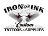
Neato's is much better.
I like how he brought in the pinstriping motif to the bottom of the sign to kind of balance things out.
I think the wings need some toughening up to look more tattoo like.
Maybe more simplified or primitive.
I agree about the font choices. It's not a good idea to have three decorative styles in the same layout.
You can bend the rules a little for a tattoo shop.
Love....Jill
WildWestDesigns
Active Member
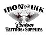
I think the wings need some toughening up to look more tattoo like.
Maybe more simplified or primitive.
Tribal maybe? That's usually a big style for tattoos.
Sign Up Graphics
New Member

Pixels Are Bad Mmmkay?
New Member
More tattoo outliney.
here's a quick-n-dirty suggestion.
If using clip art make sure your light sources match when you flip your tattoo gun.
Thanks for noticing that when I flipped the machines I failed to flip the light source. You pay attention to every detail and it shows, hence I always appreciate your feedback and help. I designed everything from the machines, to the wings, down to the ornamental flourishes. I tattooed for almost 20 years so I know the mechanics of the tattoo machine inside and out. I doubt you will find a clip art tattoo machine that accurately rendered. Most of the clip art tattoo machines I see look terrible. The only thing I didn't design, of course, was the lettering.
The wings I'm not entirely happy with. They don't have a lot going for them as far as being original and unique, but I think the style matches the way the tattoo machines are rendered so I'm happy enough. Thanks again for the suggestions. I will think about it more when I get back to this job. At the present moment the customer has seen my second rendering and is extremely happy with it, but I'm sure there is still some room to toy around with it more.
Pixels Are Bad Mmmkay?
New Member
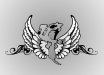
Tribal maybe? That's usually a big style for tattoos.
Over. done.
IMO.
WildWestDesigns
Active Member
Over. done.
IMO.
I have no doubt. It's over done in embroidery as well, but it does look good for certain patterns.
sar bossier
New Member
I like your latest rendering. Personally ...