• I want to thank all the members that have upgraded your accounts. I truly appreciate your support of the site monetarily. Supporting the site keeps this site up and running as a lot of work daily goes on behind the scenes. Click to Support Signs101 ...

tavern logo and graphic

Pete Moss

New Member
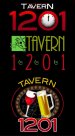
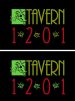
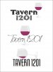
Hi folks! I'm looking for constructive critique/ criticism on these two variations of graphics for signs and graphic for multi uses. I am aware that this is quite complex for a logo, these are more intended for signage/ window graphics. The actual logo will be a simplified version. It is for a bar inside an upscale Italian Restaurant. This is my first post of my work here on Signs 101. Thanks for your time and thoughts!
 

Attachments

  • tavern1201.jpg
    tavern1201.jpg
    779.8 KB · Views: 126
  • tavern1201-1.jpg
    tavern1201-1.jpg
    759.2 KB · Views: 121

Craig Sjoquist

New Member
Well I like the start ..The one on the left reads better..the right one the brown could be wood grained and rivets with a black or dark gray smalts
The Tavern on both really needs to be a bit bigger .although will work just seems small.
Thats what I saw at 1st glance.
 

SignManiac

New Member
Not liking the font choice for Tavern. It's tuff to make upper & lower case work on an arch as you have it.
 

intensegraphics

New Member
For some reason the pics won't open for me, but from what I can see of the thumbnails, I agree with SignManiac. Definitely switch to all upper case for the word tavern. I think I would also try using the same font as the 1201 to keep it clean...
 

Rick

Certified Enneadecagon Designer
I agree with Maniac... poor font choice for Tavern and the upper/lower case... not really feeling any italian flavor here either, of course tavern does not sound Italian so that does not help... looks clip-arty (slapped together for lack of a better term)

Is this really upscale or neighborhood bar? Is there an architectural theme? (art deco, italian villa or some regional thing?) to tie it all together?

How much research did you do?
 
Have to join the crowd about the font. If it is upscale, invest the dough in some of the LHF fonts (I can think of a couple right off the bat). A couple of the SignFonts should work also.
 

Pete Moss

New Member
Thanks for all the responses so far...I was thinking about the upper/lower case issue when typing-setting the "tavern" text. That font looked Italian to me but did not look well in all upper case letters. I think this reads better, the owner wants more emphasis on 1201 which is part of the address. The olive branches in the background were created from a photo. I did a great deal research, I've done a bunch of work for the owner in the past and started the design after seeing how the interior of the business is coming together. The circular designs were created from the an Italian symbol for status. The restaurant/ bar is located downtown.
 

Attachments

  • TAVERN120101.jpg
    TAVERN120101.jpg
    777.4 KB · Views: 124

Rick

Certified Enneadecagon Designer
When I think of upscale restaurant and italian, I think of the work of Louise Fili

http://www.louisefili.com/restaurants/?c=268&n=0

She also has quite a few books on design... and even Italy...
'Italianissimo: The Quintessential Guide to What Italians Do Best'

A designer that worked for her who is very gifted http://jessicahische.com/typographizes/an-illustrative-initial-every-day

I would also thumb through Logolounge Books, in particular.. the crests and food sections.

The awkward space and balance between the bottle and wine glass is noticeable and it looks computerized. Are you exploring other ideas or just this one?
 

Pete Moss

New Member
Perfect links, thank you. I can see what you mean about the computerized look. This design is not etched in stone although I would like to utilize some of the work I've put into it already if possible. Maybe the olive branch... I also like the romance/ symbolism with the beer mug and wine glass cheering each other. The restaurant is upscale looking and I will be doing graphics on the windows as well. The thing is the owner wants to "fit in" with the bars in the area to appeal to the bar crowd so he does not want it overly fancy. I'm gathering fonts and will work up some new designs to post. Thanks again.
 

Service Sign Co

New Member
The illustration looks good, I would lower the 1201. As far as the font, it doesn't need a shadow. I used LHF Bootcut regular.
 
Last edited:

Pete Moss

New Member
With most all of the suggestions in mind I revised the old version and made a new one. Hopefully the new one feels Italian and upscale while meeting the customers 1201 emphasis and not too fancy look. The green on the new proof shows up as the actual color on the expanded view not the preview.
Thanks again!
 

Attachments

  • tavern1201-olderrevised.jpg
    tavern1201-olderrevised.jpg
    725.4 KB · Views: 103
  • TAVERN1201new bw.jpg
    TAVERN1201new bw.jpg
    575.4 KB · Views: 112
  • TAVERN1201newcolor.jpg
    TAVERN1201newcolor.jpg
    679.7 KB · Views: 88

Pete Moss

New Member
Just for kicks I'm including an older version where we basically designed going with most all of the customers direction. I had included the clock in another part of the graphic, in yet another version, and the customer asked to move it to where it is. He liked the idea of it always being noon somewhere...It does not feel Italian at all but he was going for a more "hip" look. Regardless I will be ready for a beverage when done with work today. I value all of your input to help make this logo the best I possibly can.
 

Attachments

  • tavern1201 customers.jpg
    tavern1201 customers.jpg
    29.5 KB · Views: 126

Pete Moss

New Member
Alright, posting a little too much now. I'll check back later. All three together for comparison on black colorway. Green is off on the middle logo, it should look like the previous post. Thanks Again, again.:U Rock:
 

Attachments

  • TAVERN120101options.jpg
    TAVERN120101options.jpg
    45.7 KB · Views: 107

bob

It's better to have two hands than one glove.
No matter what you do they all look like address plaques for someone named 'Tavern'. That what comes with trying to use numbers as names. Why don't you try expressing it in Roman numerals? That would be MCCI.

Apropos of nothing, when you chose a typeface to put on an arc, or most any other distortion for that matter, try to pick one that has the appearance of being at least somewhat symmetrical on X. This leaves out italics, scripts, lowercase, and most any type face that appears to be biased to the left or the right. Either via basic construction, the 'A' and 'Y' should give you your first clue, or use of serifs.
 

Marlene

New Member
I don't think the top one with the clock works at all

the one with the square with leaves and the tavern next to it has potential. the 1201 under it maybe with a sprig instead of a swirl might be better. the one with the tray is so so. the tray and drinks look good but the 1201 looks tacked on and like it doesn't belong to the rest of the design.

I'd work the one with the square as that could be really nice with just a few little tweeks
 

Pete Moss

New Member
I like how it is coming together although I feel as though it is looking more Asian than Italian. Is that just me?
 

Attachments

  • Tavern1201 finals.jpg
    Tavern1201 finals.jpg
    43.6 KB · Views: 126

Jillbeans

New Member
The first one was more sports bar, that last one is definitely more asian in feel.
There's an old bar in Pittsburgh called 1902 Tavern, I was trying to find their logo but can't.
Just a few brainstormy ideas, nothing too clever.
It's tricky when you have to work with an odd name like that.
"Tavern" to me invokes the feeling of a good beer and some cameraderie with interesting characters.
But the name seems very hi-class/upscale.
Love....Jill
 

Attachments

  • Graphic1.jpg
    Graphic1.jpg
    210.2 KB · Views: 105
Top