-
I want to thank all the members that have upgraded your accounts. I truly appreciate your support of the site monetarily. Supporting the site keeps this site up and running as a lot of work daily goes on behind the scenes. Click to Support Signs101 ...
You are using an out of date browser. It may not display this or other websites correctly.
You should upgrade or use an alternative browser.
You should upgrade or use an alternative browser.
Tee shirt artwork
- Thread starter High Octane
- Start date

Replicator
New Member
Doesn't get much sweeter than that . . . Great design brother !
High Octane
New Member
Thanks Rep!
omgsideburns
New Member
wicked.
High Octane
New Member
Thanks Tony
Shovelhead
New Member
weaselboogie
New Member
Is he eating his own intestines???
High Octane
New Member
That he is...for the most part...anyway I do agree with you Shovel...but these guys said they wanted the Blood Of Dracula font and I kinda just went with something similar to that font as I liked the flow better....but your right the font is not very metal....more goofy zombie..
omgsideburns
New Member
That he is...for the most part...anyway I do agree with you Shovel...but these guys said they wanted the Blood Of Dracula font and I kinda just went with something similar to that font as I liked the flow better....but your right the font is not very metal....more goofy zombie..
yeah i figured that's what you were going for.. reminds me of this Gwar magnet I have on my fridge that says something like "Now with more AIDS" or something.
Craig Sjoquist
New Member
out of the box wicked looking ... likes creepy
High Octane
New Member
We use a lot of opaque red....but most of this will have a white underbase....the opaque red is more of an orangey color than a true 185c type red....here I'm looking for a nice bright red. part of the red here is underbased except where the red turns to a burgundy color...in those spots I will print just a half tone of red right on top of the black to create the burgundy color..Just a two color print here....these local band guys have no money so it's do it as cheap and easy as possible.
Pat Whatley
New Member
Looks more rockabilly than metal....but I like it.
K Chez
New Member
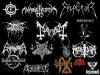
Based on the typeface I would be led to believe that this is not a serious metal band, like Gwar....it's too hokey and cartoonish!
Well beyond legible but it's a trend.
Was going to say the same thing-if you can read the logo-it's not metal! lol