• I want to thank all the members that have upgraded your accounts. I truly appreciate your support of the site monetarily. Supporting the site keeps this site up and running as a lot of work daily goes on behind the scenes. Click to Support Signs101 ...

Text size in Adobe illustrator

OADesign

New Member
Make a 3" box and turn your text into outlines, vector. Then adjust your type with scale tool to fit to size of box.
Not sure why everyone is taking so many extra steps in illustrator. What I do is the same as Johnny Best . I just don't outline the fonts. (I never outline fonts in working files, production maybe, but working never) Once you have your box and letter group you can go a couple different ways. 1) make a clipping mask from your box and then you can resize to whatever letter height you need. or 2) Once you know what the actual height is (what illustrator claims it is) then just record that number some where. I mean you shouldn't really have that many different letter heights in one job, right? So not THAT much data to remember. Or just write them down. eg. These signs need 3"h Hevetiblabla bold. In illustrator 3" Hevetiblabla bold = 4.222in.
Done and done. Unless your project requires some odd connected script. But same logic applies. But, I wholeheartedly agree, adobe should consider the sign/wide format print industry a lot more when it comes to features. I think it might even bring some of them back as customers.
 

WildWestDesigns

Active Member
But, I wholeheartedly agree, adobe should consider the sign/wide format print industry a lot more when it comes to features. I think it might even bring some of them back as customers.

Unfortunately, I just think that's too small of a demographic slice from their overall customer base. I actually have to wonder just where Adobe CC is in their overall portfolio. I have to wonder how things like Experience Cloud, what those customers are generating compared to Adobe CC customers. Although I'm sure there is some overlap there (or maybe a lot).

No matter what though, there is always going to be limitations, always will need that further niche software that has those features. They add this feature, there is always going to be another feature that they lack that the sign/wide format printing (or whatever group) needs.

Then, of course, where does the feature implementation for niche groups stop? Again, I consider Ai/DRAW and the like more general purpose. It's the addons/plugins/extensions that are created by 3rd parties that help extend that base program for any niche needs. Otherwise, they would have to pick a niche track and go with it, they can't go down every one of those at the same time.

Or maybe I'm just nuts and don't mind the slight workarounds, extensions, plugins etc to help further refine the programs without having to have the main vendor screw around with the base programming so much.
 

MikePro

New Member
our old-school way about this, was to have a chart handy that showed what the conversion from "pt" to "in" for your standard dimensions, 1"/2"/3"/etc. so when you type in illustrator, and you know you needed 3" copy, you just looked at the chart and knew you needed "320pt" type.

edited to add: theoretically, 72pt = 1 inch, but it seems to vary with different fonts and descenders/round letters.
 
Last edited:

The Vector Doctor

Chief Bezier Manipulator
Six fonts set using a completely flat capital letter. Six different heights despite the same point/inch size. I don't think this is the fault of the program but rather the type companies that produce the fonts
 

Attachments

  • Screen Shot 2019-10-21 at 8.45.19 PM.png
    Screen Shot 2019-10-21 at 8.45.19 PM.png
    28.8 KB · Views: 130

GAC05

Quit buggin' me
Using the Rube Goldberg approach > set the text in points > zoom the screen level to 100% > use a metric steel rule against the monitor > convert the mm result to inches > adjust text size from there,
 

Bobby H

Arial Sucks.
Johnny Best said:
f you had to do a third of the stuff Illustrator does 50 years ago then I see a big time user, but using your brain outside the box once in awhile is good for you. It takes me longer to read a Bobby H reply than it does to do the sequence of sizing a letter.

Okay, Johnny. Please explain in specifics just how you quickly size capital letters in a text object to a specific size without converting the text to outlines. Please explain in specifics just how you vertically align a text object to a container shape without converting the text to outlines. Keep in mind once you convert a given text object to outlines you're all but guessing unless the type is a geometric sans serif face.

I've been using Adobe Illustrator for close to 30 years. But, hey, I am all ears for hearing someone explain how to do something easy in a program that should have been obviously easy clear back to the late 19-freaking-eighties. If you want to insult me back up the insult with some actual expertise dealing with my complaint. If not, you're only adding static and nothing constructive at all.

Your quote from the Adobe support community is also a non-starter. I've heard that tired excuse before as well. Nevertheless it is an extremely common task to have to vertically center text objects in other container objects. And the default reference for alignment is the size of the capital letter.

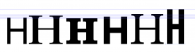
All fonts have built in dimensions that numerically define the baseline and cap height lines, as well as overall em square size and other values like ascender and descender. It is very common for many kinds of typefaces to overshoot the baselines, cap height lines and other values. Nevertheless, the font's dimensions of distance between the baseline and cap height line is the real important value. That's the reference value that needs to be used for sizing, positioning and aligning active text objects. Nearly all typefaces are optically designed in relation to their defined baselines and cap height lines, even if the characters overshoot a bit. Exceptions to the rule are rare. Import Bickham Script Pro into Font Lab Studio to see something wacky, but that's a typeface containing glyphs with some pretty outrageous swashes.

TimToad said:
Can't you just go in "preferences" and under "units" set your type to inches instead of points?

If you try it out you'll see it doesn't work. If you set the type units to inches and define some lettering as being 2" tall, the cap letters won't be anywhere near 2" tall if you convert the text object to outlines.

Gino said:
Yes, but it's still not the true size, it's still working off the ems.

Illustrator isn't even working off the em square. I've looked this up by opening specific font files in Font Lab Studio and looking at the font dimensions and comparing those numerical values with what Adobe Illustrator spits out with its bounding box nonsense. That bounding box Adobe Illustrator creates around type objects has no relation to a font's em square values. They're not the same size. As far as I can tell it is just a random made up thing.

eahicks said:
LOL....I am pretty sure they have it set that way....but still type does not come out the size you set as far as the capital letters. It measures top to bottom of all letters.

Adobe Illustrator doesn't even do that. It measures the bounding box that overshoots well around the ascenders and descenders of all letters.

TimToad said:
So if I need to match a cap height EXACTLY, I take about 5 seconds and use my rectangle box tool to draw a box with no fill and a thin stroke exactly the height and/or width I need and adjust my text to it incrementally. Holding the shift key while adjusting sizing speeds the process up greatly until you zero in on it.

That's still an inaccurate, manual kludge approach that only works with geometric sans faces with no flares or other odd slants to them. What is really needed is something that can be numerically defined on a consistent basis.

Johnny Best said:
Maybe someone touched on this already but there is another way to size typ to a specific size.
Type in your letter, create outline, go to Transform (in Window column) and type in your height. Make sure it is set so it has the constrain height and width proportion. I find it faster this way.

CorelDRAW accomplishes that still-crude approach faster only by nature of its "Artistic Text" tool. If you choose a geometric sans font, like Helvetica or Gotham, and type out a capital letter like "E" you can size it accurately to a specific size, position or align it as needed and then add the desired copy to that place holder text object. The approach falls apart with many other typefaces.

Nearly all serif text typefaces have many (or all) characters overshoot the baseline and even the cap height line. Script faces do that even more. The same goes for most display faces. But every one of those fonts has a specifically defined baseline and cap height line. Those values and the distance between them can be referenced for sizing, positioning and alignment in many tasks we do in sign design. A proper set of tools looking at those values would save us all a bunch of time.
 

Gino

Premium Subscriber
As long as no one takes offense to this...... what does it matter when making signs if you are dead balls on with the height of a letter, that many of these quick fixes will give you ?? I've never been arrested for giving someone a 1.97 inch letter cap height when they asked for 2 inches. The design police around here are very understanding in that respect.

Now, if you're doing brochure work, magazine layout or architectural stuff, maybe there ya need it, but then you are in the wrong programs to begin with. When I used Gerber, ANAgraph and SignMate, and I asked for a specific letter height, it did it without any problems....... but they were sign programs, not this Illy or Corel crap. These programs being used today are hardly sign programs, so you get what you pay for...... or just do the work arounds. Desk top sh!t vs signwork are two different animals.
 

WildWestDesigns

Active Member
When I used Gerber, ANAgraph and SignMate, and I asked for a specific letter height, it did it without any problems....... but they were sign programs, not this Illy or Corel crap.

That's what I've been trying to say. These are general purpose programs (I wouldn't go so far as to say "crap", but to each their own) and as such, having to do work arounds are to be expected for very niche workflows.

If it was apparent 30 yrs ago that it was lacking functions that it should have obviously had, then that should have given plenty of time to get used to work arounds or to go to another program that was actually specifically designed for the desired use case.

Adobe has done very well for it's self, so I highly doubt that they have any incentive to actually put in that functionality (that I would argue isn't needed for a general purpose program like Adobe, for a sign specific program, that's a different story). If it was incumbent on Adobe to implement that functionality (for a demographic that I don't think that they were actually targeting in the first place), I could think of a lot of other specific functionality that I could have benefited from that wouldn't have required all that scripting, plugins and/or macros.
 

James Burke

Being a grandpa is more fun than working
Overall, I've appreciated the AI user experience for almost 20 years. But I am slowly migrating back to Corel as our business moves forward.

Text height is a minor issue here, but explain to me why Illustrator (a pioneer in the industry) can not full justify a paragraph of text and Corel can. The full justify button shows up on Illustrator but it doesn't do anything.

I understand it's a feature in Indesign, but I don't subscribe to CC.


JB
 

WildWestDesigns

Active Member
I understand it's a feature in Indesign, but I don't subscribe to CC.


JB

The way that I've always approached using the Master Suite is use the dedicated program that excels at that point of the project. In other words, yes there maybe rudimentary raster work in Ai, but if I wanted to get nitty gritty with my pixel pushing, I would take that file and use Ps to work that part of my magic. Same thing with Id, or Fl or whatever I may be trying to do.

Use the appropriate program for whatever work I may be trying to do. The nice thing about Adobe suite, is Adobe has really excelled at making everything work seamlessly, at least that was the case when I was using it. I loved using their programs, just had a problem with ancillary issues unrelated to how I would use the features of their programs.
 

Johnny Best

Active Member
Well guess what "sport fans", you can adjust type size to any height in Affinity Designer with out putting text in outline!
Screen Shot 2019-10-22 at 10.37.50 AM.png
 

James Burke

Being a grandpa is more fun than working
use the dedicated program that excels at that point of the project.

I can't understand why it's necessary to integrate another platform for one of the most basic typography manipulations. Piecemeal applications are nothing more than revenue generators. There is plenty of overlap between them, yet just enough of a gap to require the use of multiples.

JB
 

WildWestDesigns

Active Member
This:

Piecemeal applications are nothing more than revenue generators.

conflicts with this:

There is plenty of overlap between them, yet just enough of a gap to require the use of multiples.

While I do admit that it does help with revenue generating, at what point does integrating other crossover features to where the vendor might as well create everything in one program? I could easily see it being a slippery slope as to when does one stop adding in the "basic" overlapping features and when one might as well have everything in the program for any possible situation.

In some ways, that could lead to over complicating the program's code which would make integrating other features a concern, as everything has to play nicely with each other. Bringing it in after the fact, even more so. Might as well try to start fresh with the code base, instead of tacking it on. Which may mean losing some of that ability of being able to read older files.
 
Last edited:

Bobby H

Arial Sucks.
Johnny Best said:
Well guess what "sport fans", you can adjust type size to any height in Affinity Designer with out putting text in outline!

screen-shot-2019-10-22-at-10-37-50-am-png.143515


One problem with your example: you have the lettering sized according to the height of the "C" letter. Round letters like that commonly rise above the cap height line and dip below the baseline.

Below are some screen shot images of glyphs in Font Lab Studio. One is a "E" from Adobe Garamond Pro. Then there's an "E" and "Q" from Helvetica Now. Finally there is a alternate "M" character from the brush typeface Sanelma.

FontLabImage-AGaraPro-E.png FontLabImage-HelvXBlk-E.png FontLabImage-HelvXBlk-Q.png FontLabImage-Sanelma-AltM.png

The "E" in Helvetica Now lines up perfectly with the baseline and cap height line. The "Q" overshoots both lines significantly. The "E" in Garamond Pro also overshoots both boundaries slightly (a very common trait of serif text faces). Nevertheless, most serif and sans serif typefaces are optically designed to adhere to the baseline and cap height line. The distance between those two lines would be very useful for sizing, aligning and positioning type.

Script typefaces are another matter. Their dimension values of baseline, cap height, ascender and descender can vary wildly from one typeface to the next. The big problem is script faces often have cap height line settings positioned well above the actual tops of capital letters. The distances of blank space can get really big if the typeface has lots of swash alternate characters (Bickham Script Pro is an extreme example of this).
 

OADesign

New Member
Or maybe I'm just nuts and don't mind the slight workarounds, extensions, plugins etc to help further refine the programs without having to have the main vendor screw around with the base programming so much.

^This. Me too.

[inserting tangent here]

But if I had my wish: Adobe would buy out cadtools. Make those extras part of the default tool set in illustrator. And then make the shape creation tools and art board limit like Flexi. I would be good to go.
(I know. I know. But illustrator is for this and flexi for that and corel is ...) I get it. But I said MY wish.
 

jimbug72

New Member
While I do semi-regularly wish Illustrator had the capability it is relatively simple to work around. It would be nice to not need to work around but it is what it is. I generally use the method Johnny Best described but sometimes I have instances where it's best to keep the type "live".

A good for instance is when I have a ordinance required letter height that needs to fit into a certain space so I'll need actual letter height to know the best way to set the type to fit the space. Generally my method is to make an upper case A, convert it to outlines and size accordingly. Then I will type another A and size it to match the height of the outlined letter and I have live type the size I need. It only takes a few extra seconds and it would be nice to simply have a setting in the software I could toggle to manage that for me but it's not great loss not having it. If I took all the time I've spent converting type to outlines to get the proper size over the last 10 years I'd guess I've probably "lost" about 15 minutes collectively.
 

WildWestDesigns

Active Member
But if I had my wish: Adobe would buy out cadtools.

See, I think this is where different experiences come in.

I keep on losing functionality in those other programs when Adobe buys them. Typically, they put those features out to pasture. In some instances, it's because they were buying out the competition and didn't integrate those features into Ai or they were in fact adding in those features, but they took away from particular platform support, which is what I'm expecting to happen with Substance Painter next year (of course, even if they kept support, I probably wouldn't get it anyway, just because I totally despise the subscription module and there are still other alternatives out there).
 
Top