-
I want to thank all the members that have upgraded your accounts. I truly appreciate your support of the site monetarily. Supporting the site keeps this site up and running as a lot of work daily goes on behind the scenes. Click to Support Signs101 ...
You are using an out of date browser. It may not display this or other websites correctly.
You should upgrade or use an alternative browser.
You should upgrade or use an alternative browser.
thats make 2 this month!! wtf?
- Thread starter redline graphics
- Start date
Roto
New Member
ITS UGLY....and 2 would make twice as ugly!!!!!! i think you need to explain a bit more as to wtf we are supposed to be concerened with!!!!
I think the technical term is "Fugly"
redline graphics
New Member
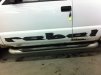
This is a repair I need to do. Both sides. What's the font?
TheSnowman
New Member
Yep, ones like this I normally do a good straight shot and email it right from my iphone to Eric and he has it to me the next morning when I come in.
redline graphics
New Member
I would have done that too.Taken pic and traced, But the shop took the pic and removed the decals. Anything close? I asked them and anything close to that font would be ok.
GoodPeopleFlags
New Member
oldgoatroper
Roper of Goats. Old ones.
maybe try starting with Latin Wide and then convert to curves (paths) and start yanking control points around...

oldgoatroper
Roper of Goats. Old ones.
hmmm....
Why, I do believe that's it... whatever it is...
ucmj22
New Member
Why, I do believe that's it... whatever it is...
because I took 7 minutes and traced it.
J
john1
Guest
Come on man, That's a simple trace. It's so ugly you can't possibly trace it terribly.