• I want to thank all the members that have upgraded your accounts. I truly appreciate your support of the site monetarily. Supporting the site keeps this site up and running as a lot of work daily goes on behind the scenes. Click to Support Signs101 ...

The Exterior Company

aandrews19

New Member
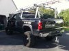
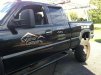
Job I had on Monday. Nothing extraordinary. Pretty simple, but I like the way it turned out.

Oracal 751 White
Oracal 951M Red Gold
 

Attachments

  • 241761_333614196731965_293701429_o.jpg
    241761_333614196731965_293701429_o.jpg
    53.5 KB · Views: 108
  • 280793_333614310065287_1248380548_o.jpg
    280793_333614310065287_1248380548_o.jpg
    86.7 KB · Views: 90
  • 472266_333614150065303_156971536_o.jpg
    472266_333614150065303_156971536_o.jpg
    73.7 KB · Views: 101

Jillbeans

New Member
I would have liked to see more emphasis on the name and less on the phone number, particularly on the back.
But that's probably what the client asked for.
Not dissing you, it's nice and uncluttered.
The name could have been a bit bolder is all.
Love....Jill
 

SignManiac

New Member
I would have liked to see more emphasis on the name and less on the phone number, particularly on the back.
But that's probably what the client asked for.
Not dissing you, it's nice and uncluttered.
The name could have been a bit bolder is all.
Love....Jill

+1
 

Craig Sjoquist

New Member
Looks nice, un-cluttered.
The logo does seem light indeed but if that is what it is, you did well by making phone number bold as can be.

Would liked to see area code not so bold, giving all the strength to just 7 numbers to me area code everyone knows all ready, so just a reference even out of town.

Sure does look good all in all .. not like in Orlando most are fully cluttered, insulting to look at.
 

aandrews19

New Member
I designed the logo for this guy a few months ago, and I basically became a puppet. He is a nice guy, but when he has something in his head...that's it. He pays in full on time, and he keeps coming back to me for everything he needs, so I can't complain too much. Sometimes I guess you just have to suck it up and deal with stubborn people.

There are some things I am unhappy with, such as weight of the font in the logo, so much emphasis on the number, etc. But overall, I don't think it turned out too bad.

...he did bring me a dirty-*** truck :doh:
 
Top