-
I want to thank all the members that have upgraded your accounts. I truly appreciate your support of the site monetarily. Supporting the site keeps this site up and running as a lot of work daily goes on behind the scenes. Click to Support Signs101 ...
You are using an out of date browser. It may not display this or other websites correctly.
You should upgrade or use an alternative browser.
You should upgrade or use an alternative browser.
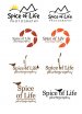
This is what I'm working on now, thoughts?
- Thread starter Signmaker1234
- Start date

Fred Weiss
Merchant Member
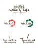
I like the Spice of Life third row on the left but without the butterfly.
Jillbeans
New Member
If forced to choose, I would select the bottom right.
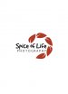
I'd put "photography" in a panel underneath, all-caps no script.
You don't have to overload your logos with cutesy clip art.
Think of using images as seasoning a good dish.
Too many can ruin things.
The fonts are all very generic.
Love....Jill
I'd put "photography" in a panel underneath, all-caps no script.
You don't have to overload your logos with cutesy clip art.
Think of using images as seasoning a good dish.
Too many can ruin things.
The fonts are all very generic.
Love....Jill
Signmaker1234
New Member

Signmaker1234
New Member


DerbyCitySignGuy
New Member
When I glanced at the leaf logo all I could see was a shrimp and now I can't un-see it.
Zac
Mediocre Designer
I get what you're trying to do with the leaves/aperture logo but it definitely doesn't come across that way to non-industry people and looks like hooves like others are saying.
I do like Tiki's design concept, and also like font on the cartoony one.
Off-topic: And just to point out, all vegans constantly say they're vegans. Didn't think I'd run across that stereotype on sign forums haha.
I do like Tiki's design concept, and also like font on the cartoony one.
( although I am a vegan) :Big Laugh
Off-topic: And just to point out, all vegans constantly say they're vegans. Didn't think I'd run across that stereotype on sign forums haha.
Cross Signs
We Make Them Hot and Fresh Everyday
+1 Tiki Boy
Signmaker1234
New Member
This is where I'm at now, I think I took care of the hoof problem by adding the leaf stems and the lobster issue by making the leaves green! I showed this design to over 10 people and not one said "hoofs" or "lobster" and all like the leaves orange. It was everyone's favorite of the 3 designs! I also changed the font.
Attachments
Marlene
New Member
the one with the green leaves looks the best to me from the choices. not sure why you feel like you have to have a ton on images when one good one would work. the one with the weed, bird and butterfly is high school girl decorating her note book level as it is so over done. the font isn't one that says "spice of life" and feels wrong for this project. I don't hate the swirl of leaves in green but think a font more appropriate for the type of buisness would work better